UI Design, Branding, Environmental Graphics, Logo, Icon
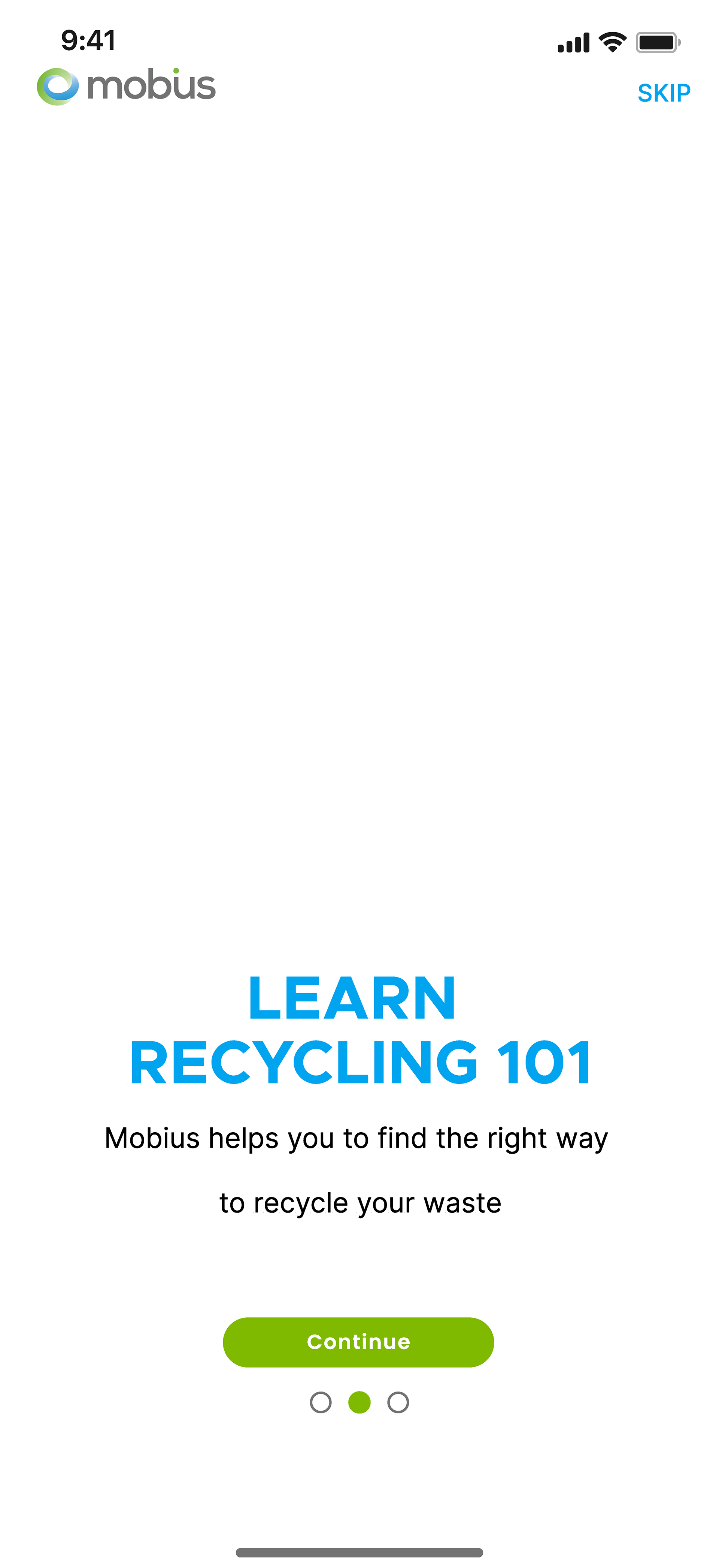
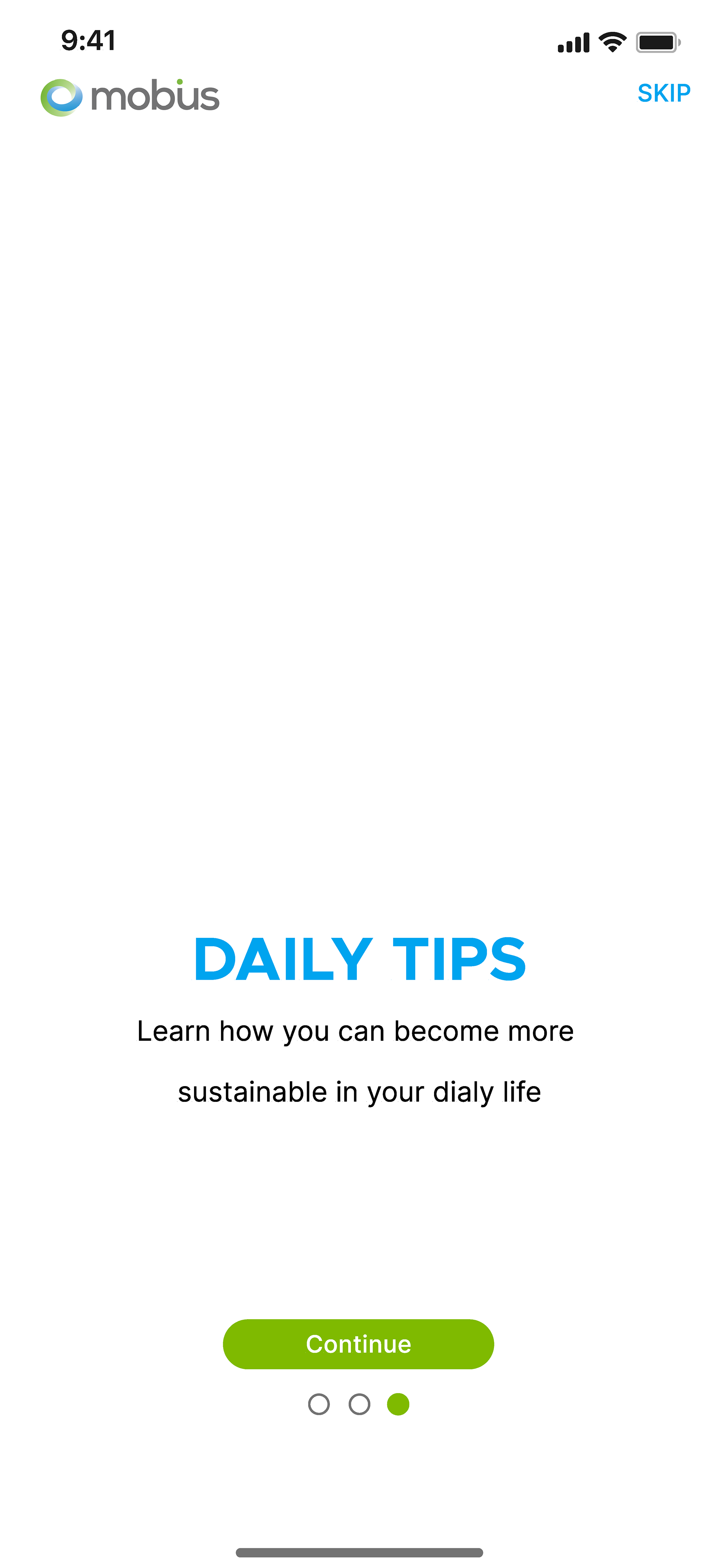
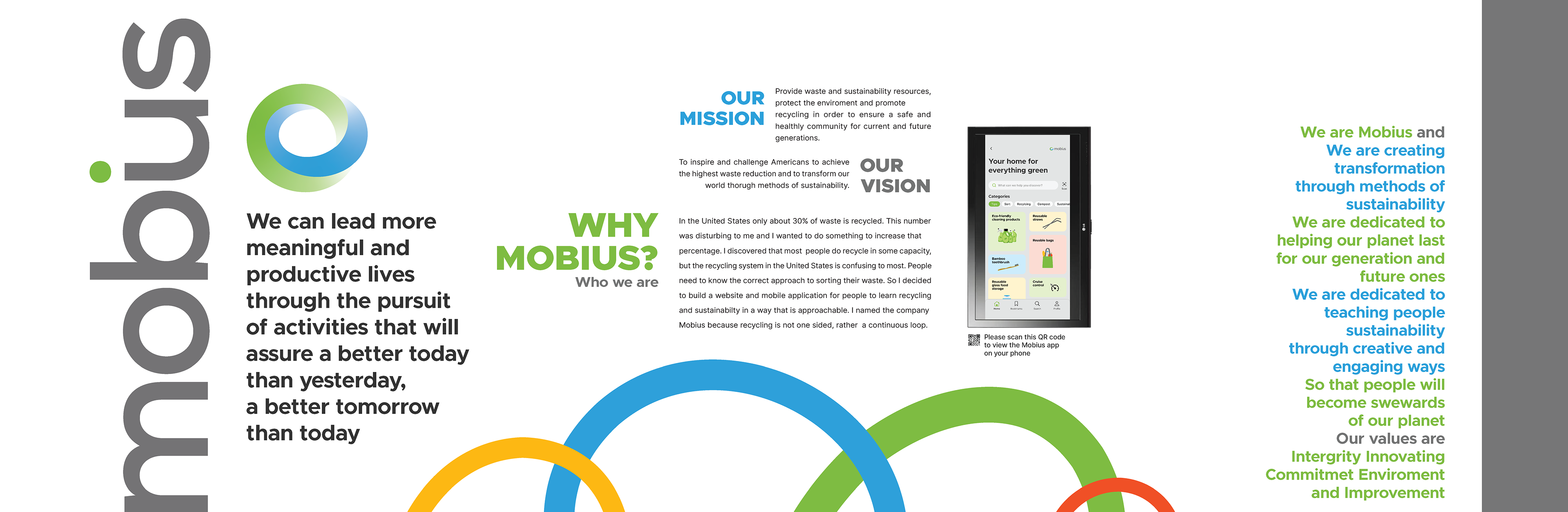
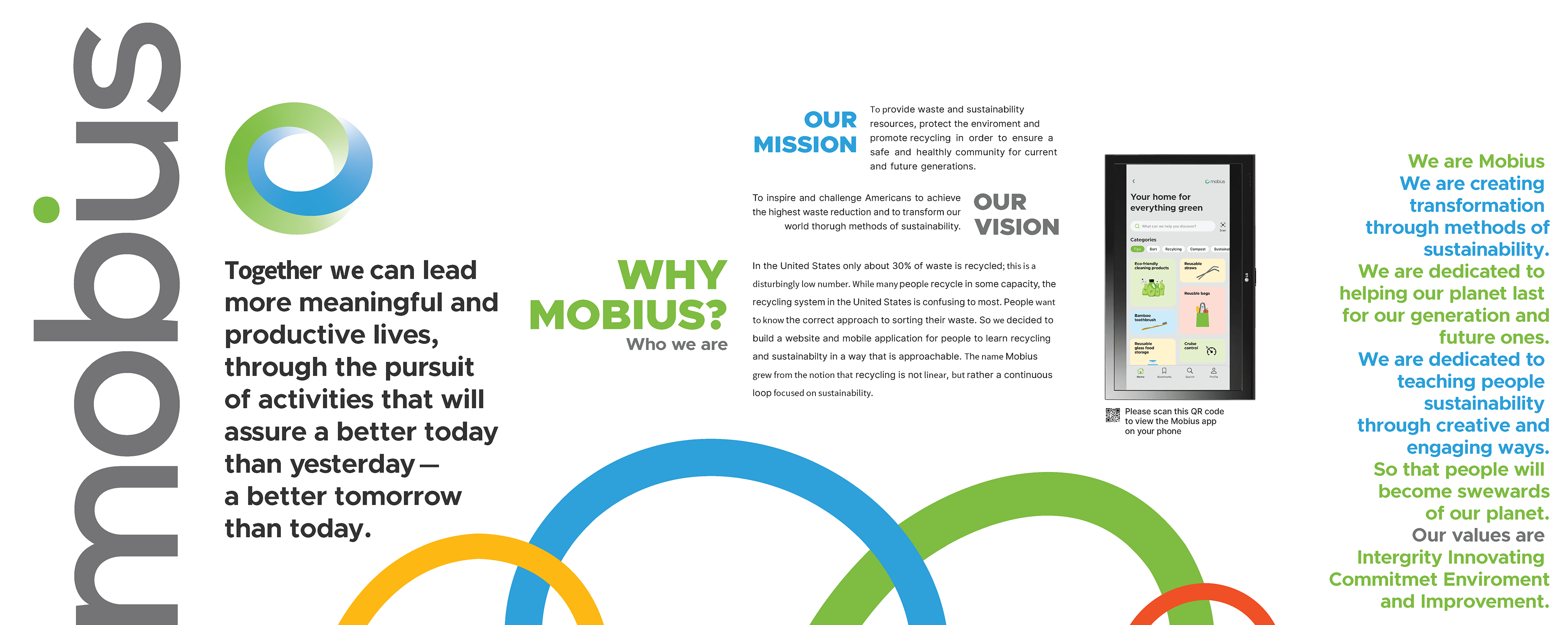
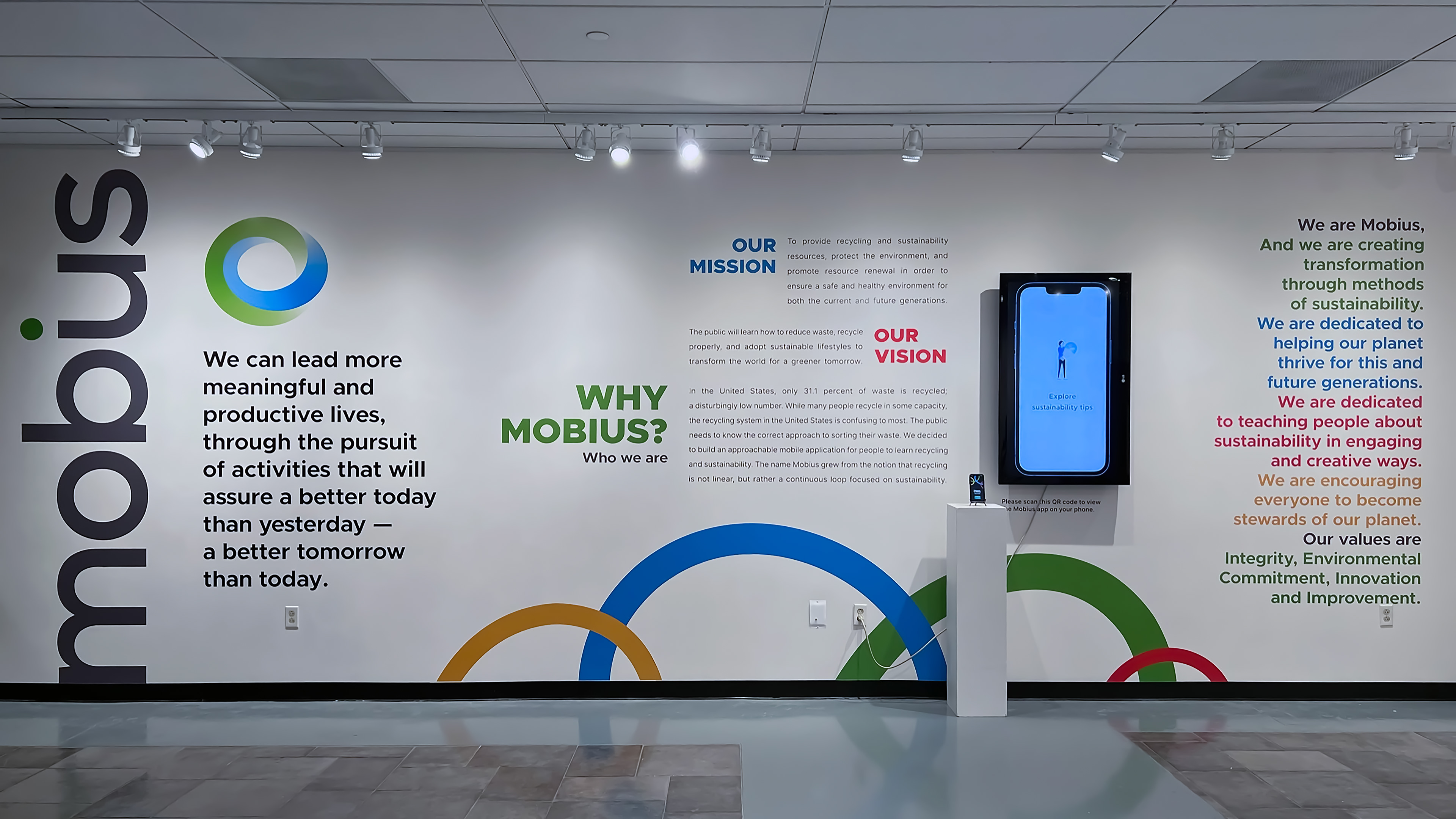
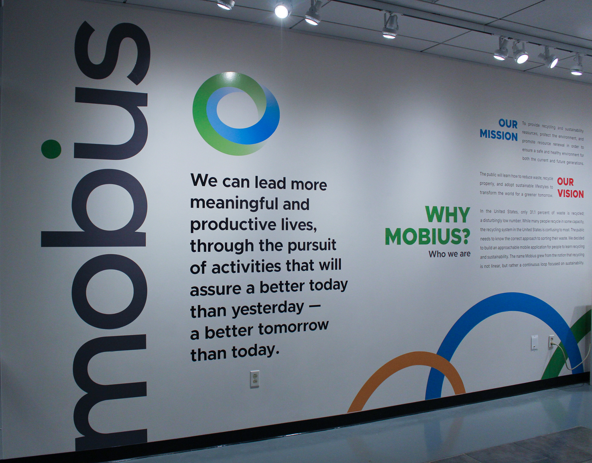
A forward-thinking recycling company focused on spreading the importance of environmental soundness by teaching people the basics of recycling and sustainability tips. Mobius's brand system extends the logo's energy to the app and environmental graphics. With sustainability initiatives on the rise, Mobius is equipped to redefine the perception of recycling and sustainability.

dd
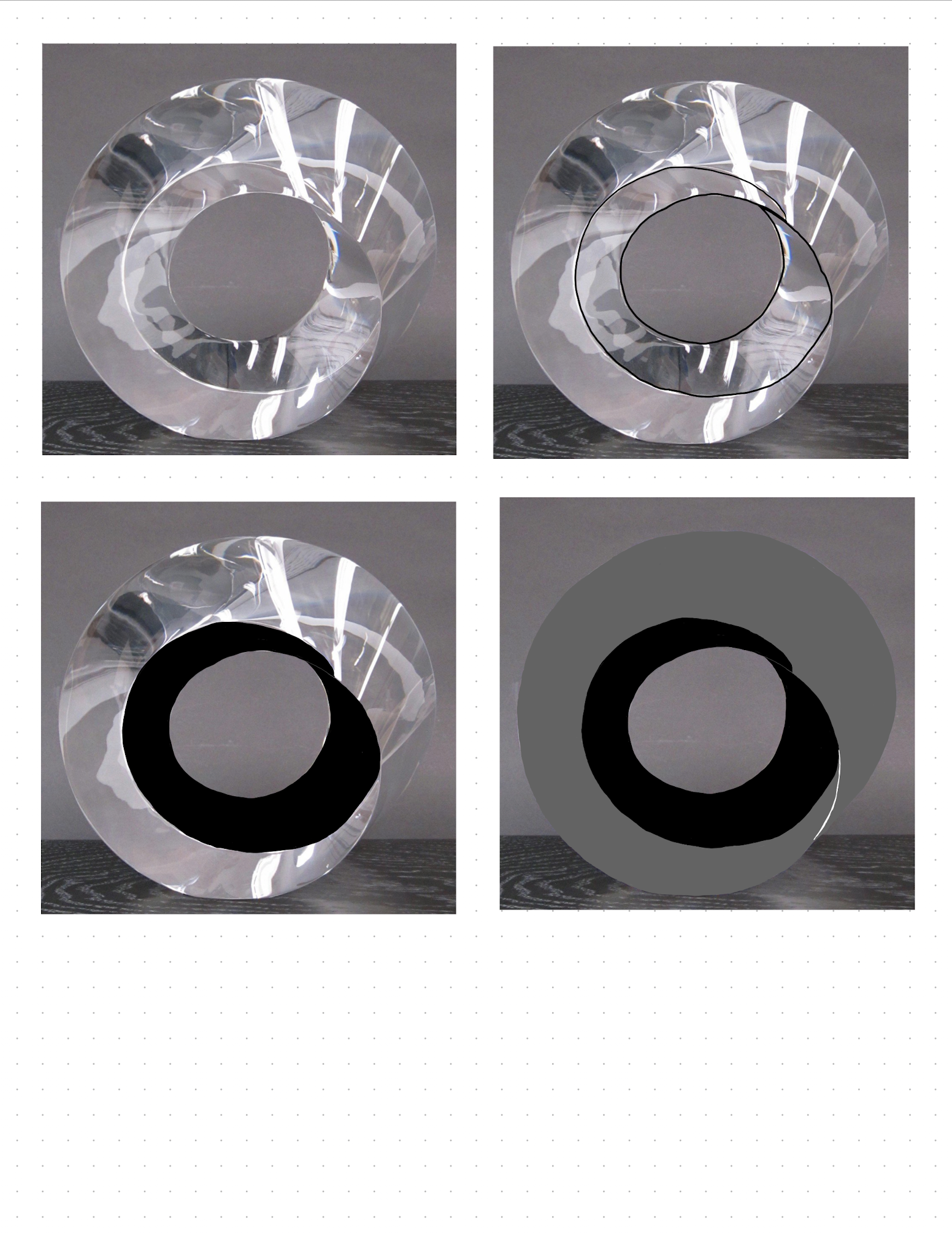
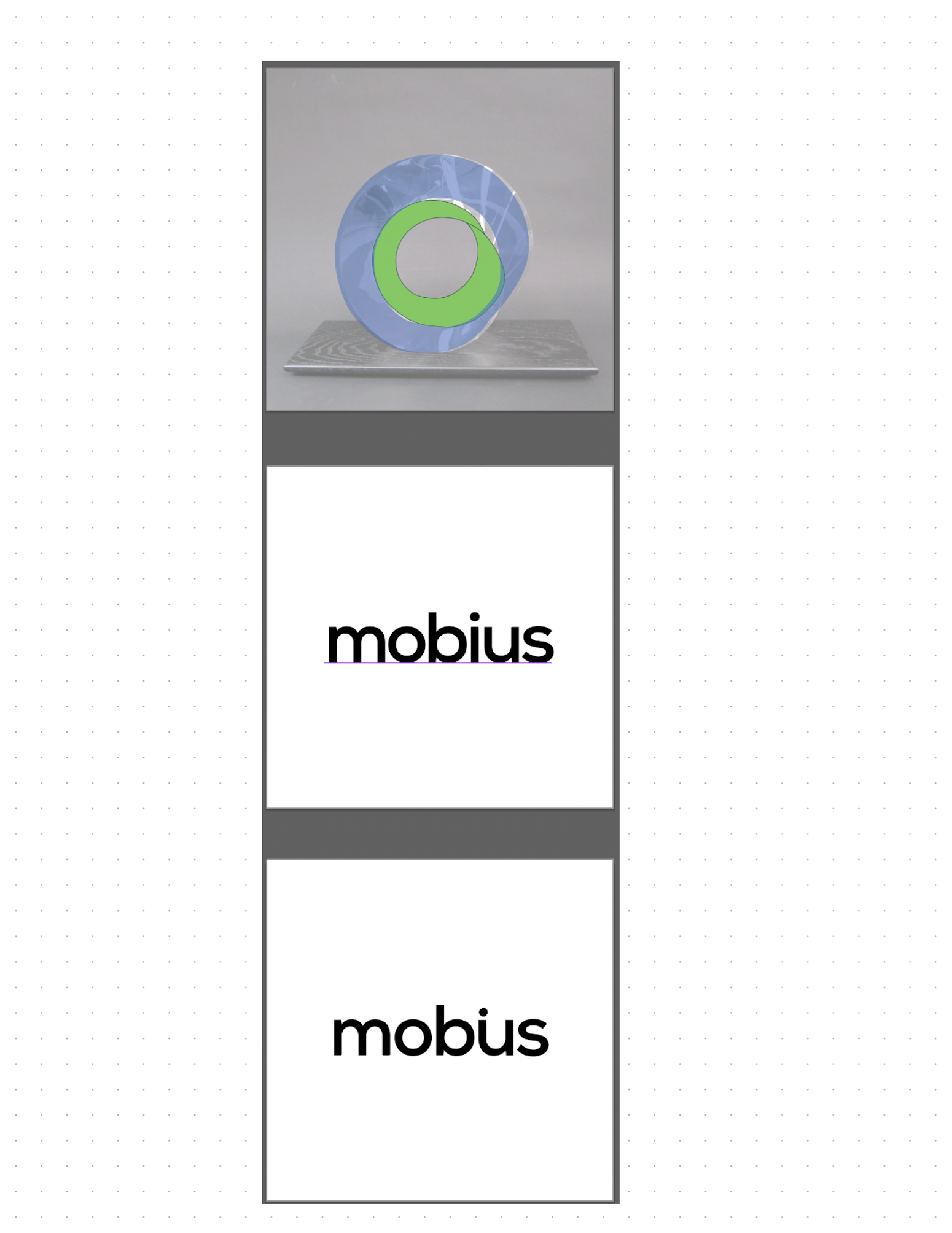
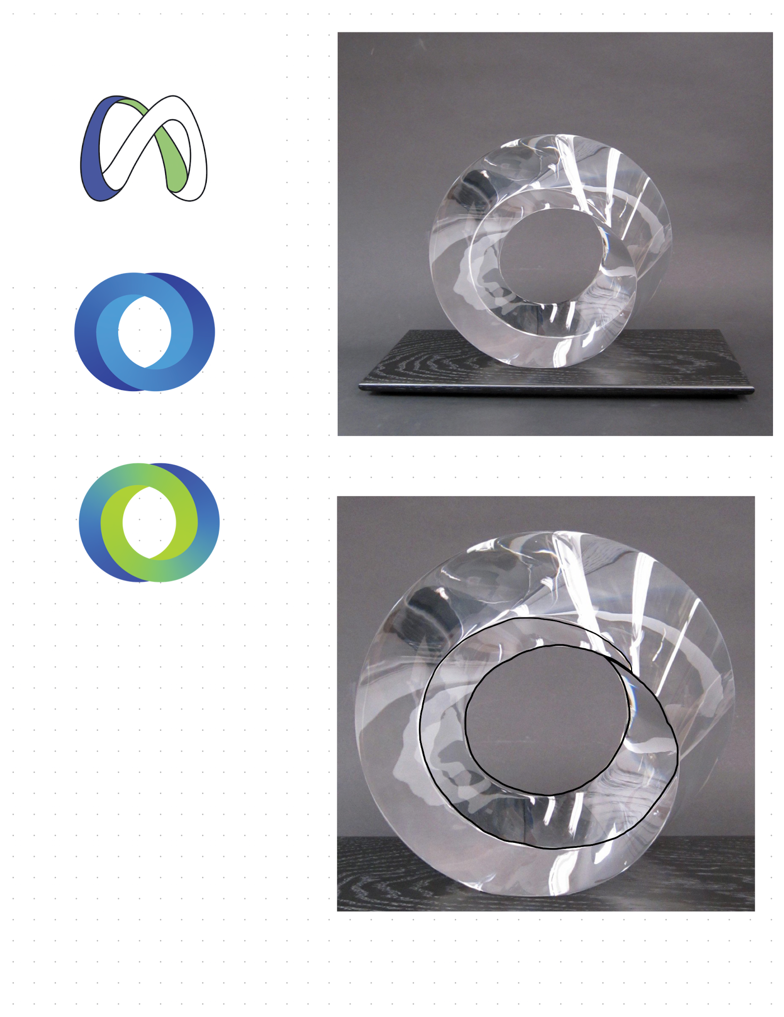
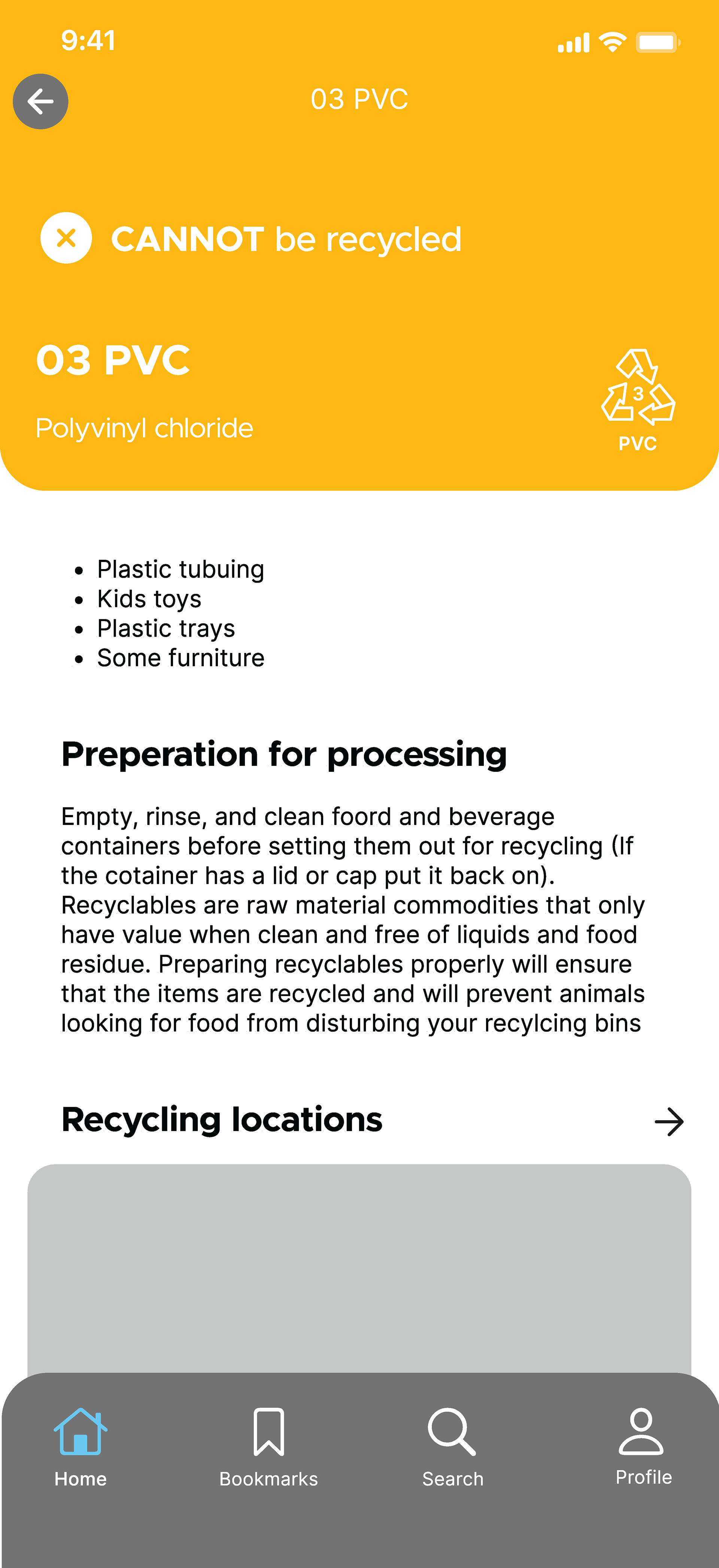
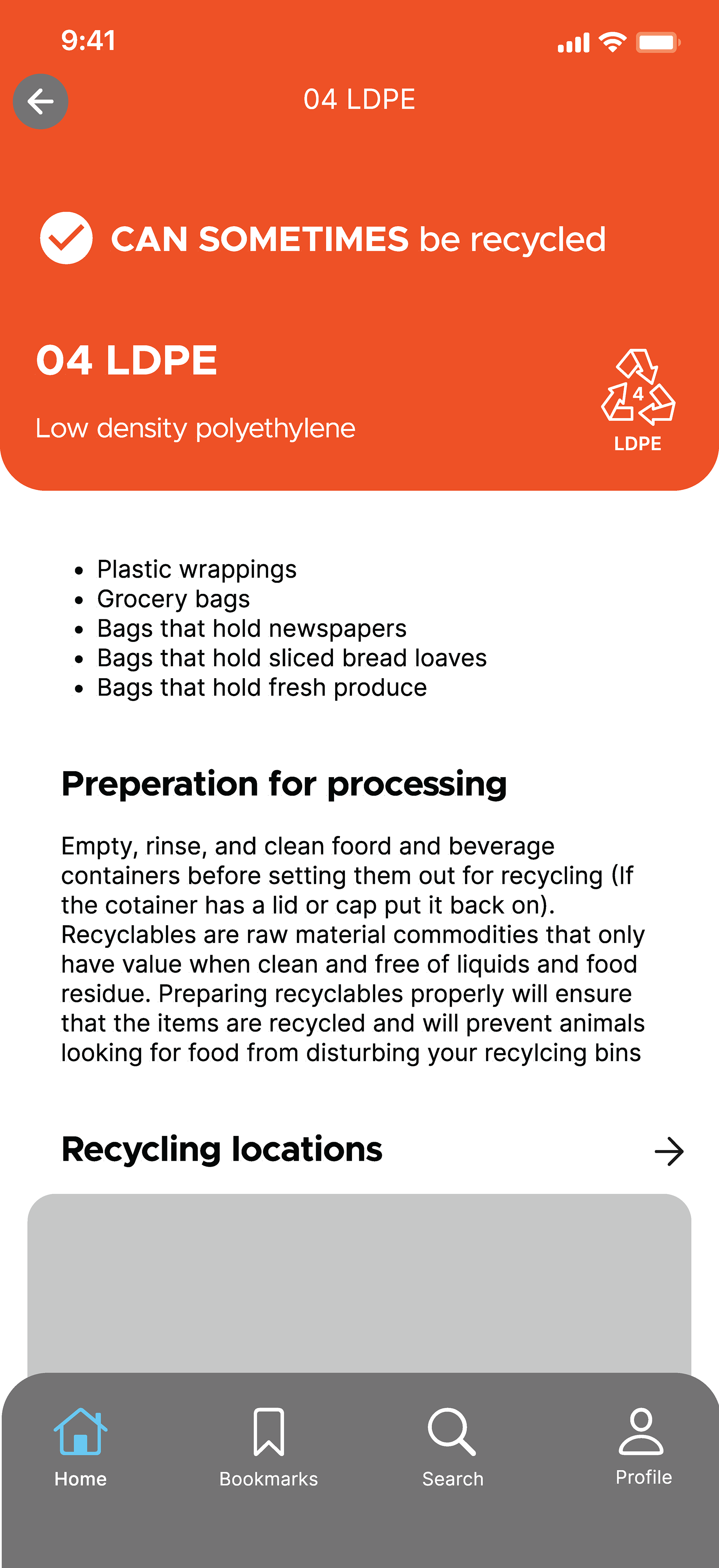
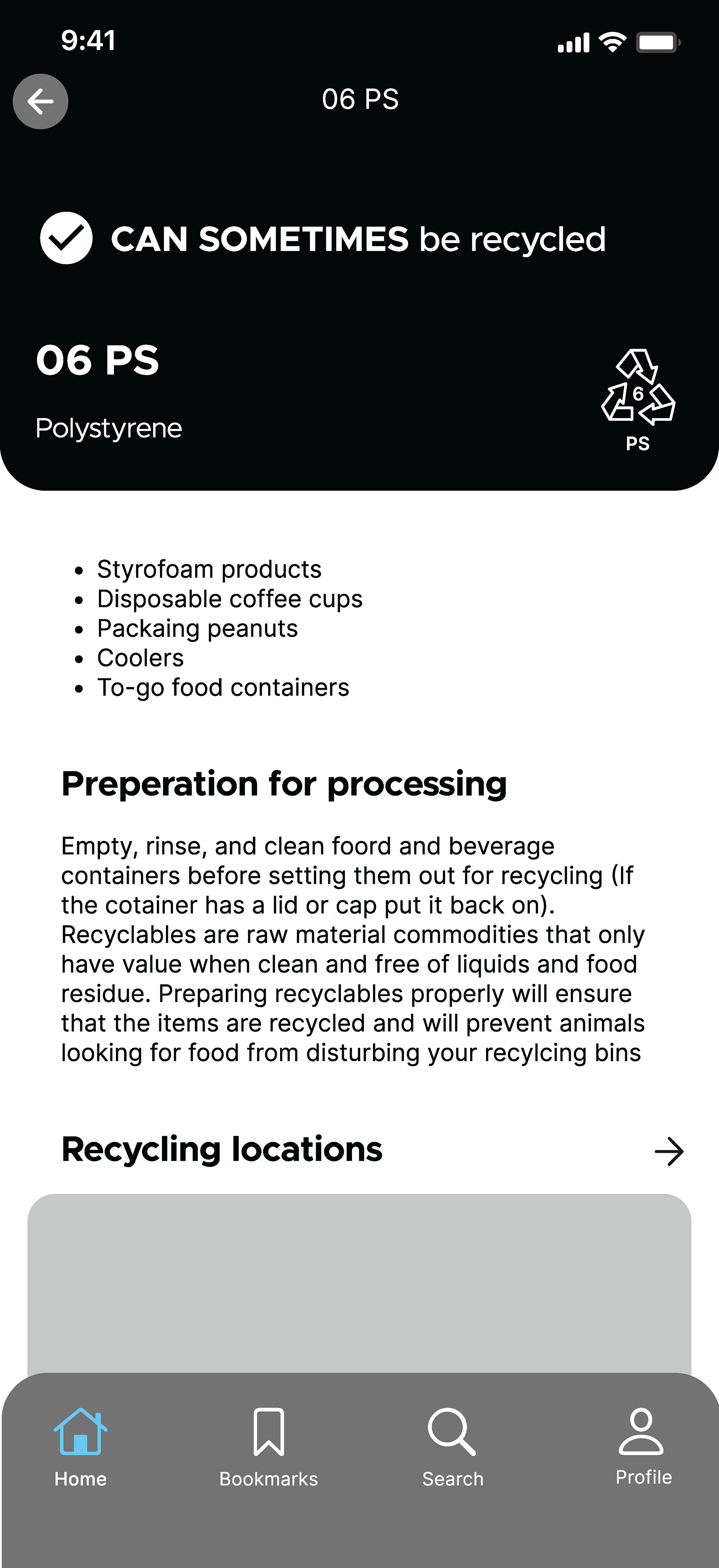
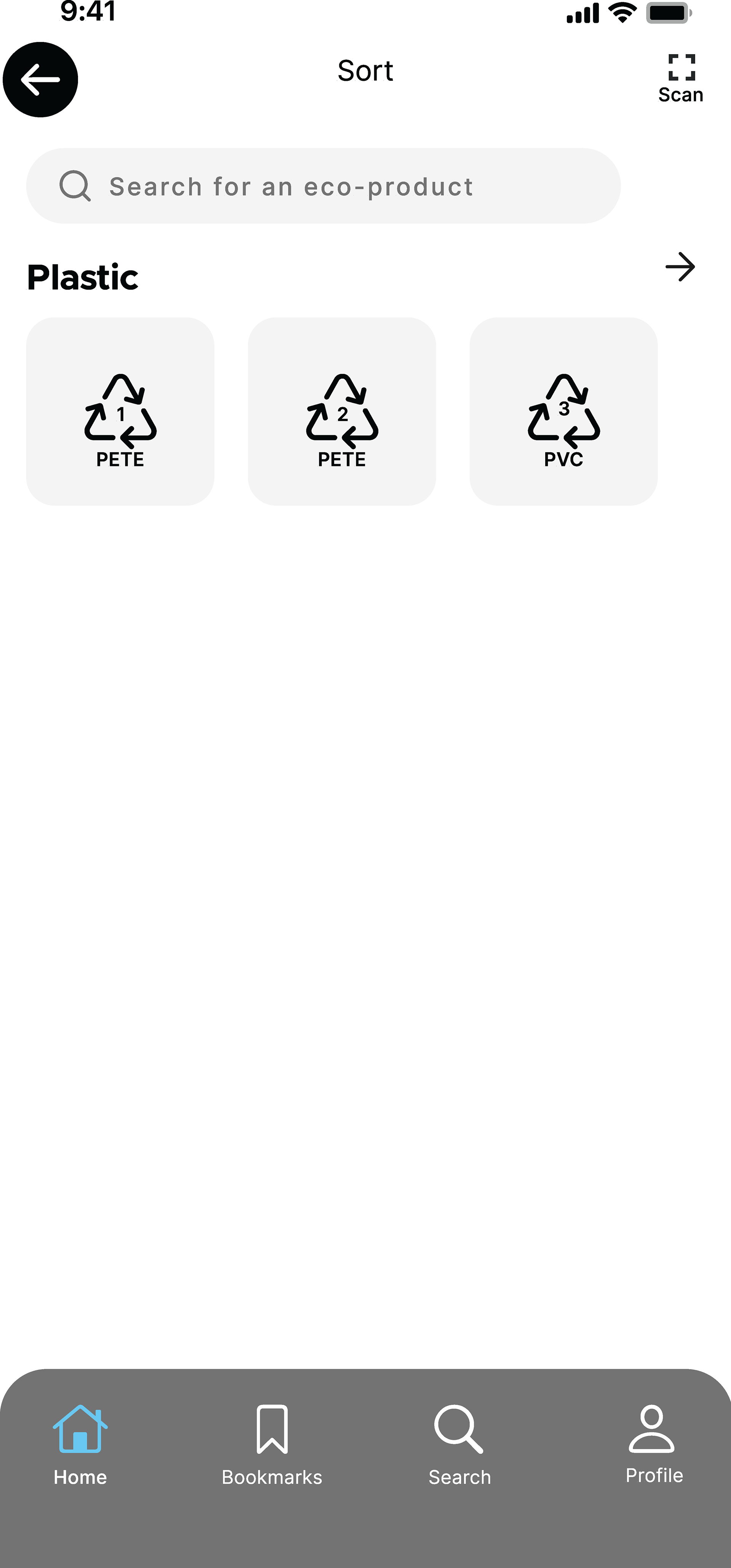
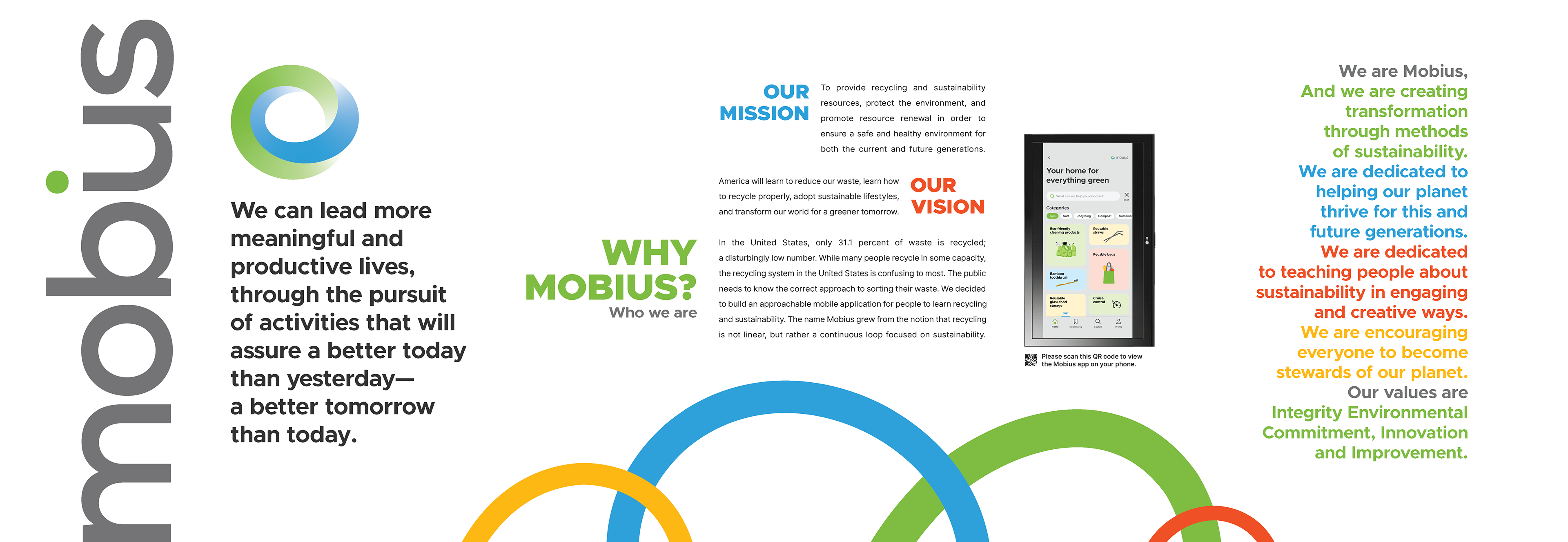
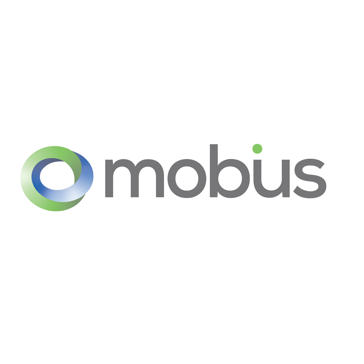
The logo illustrates the brand names and conveys the core brand message—that recycling is not linear, but rather a continuous loop focused on sustainability.


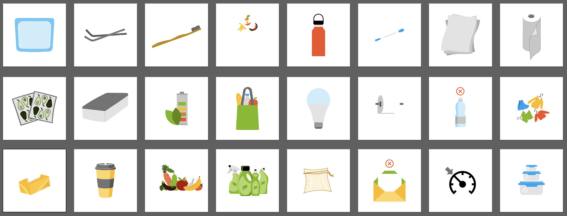
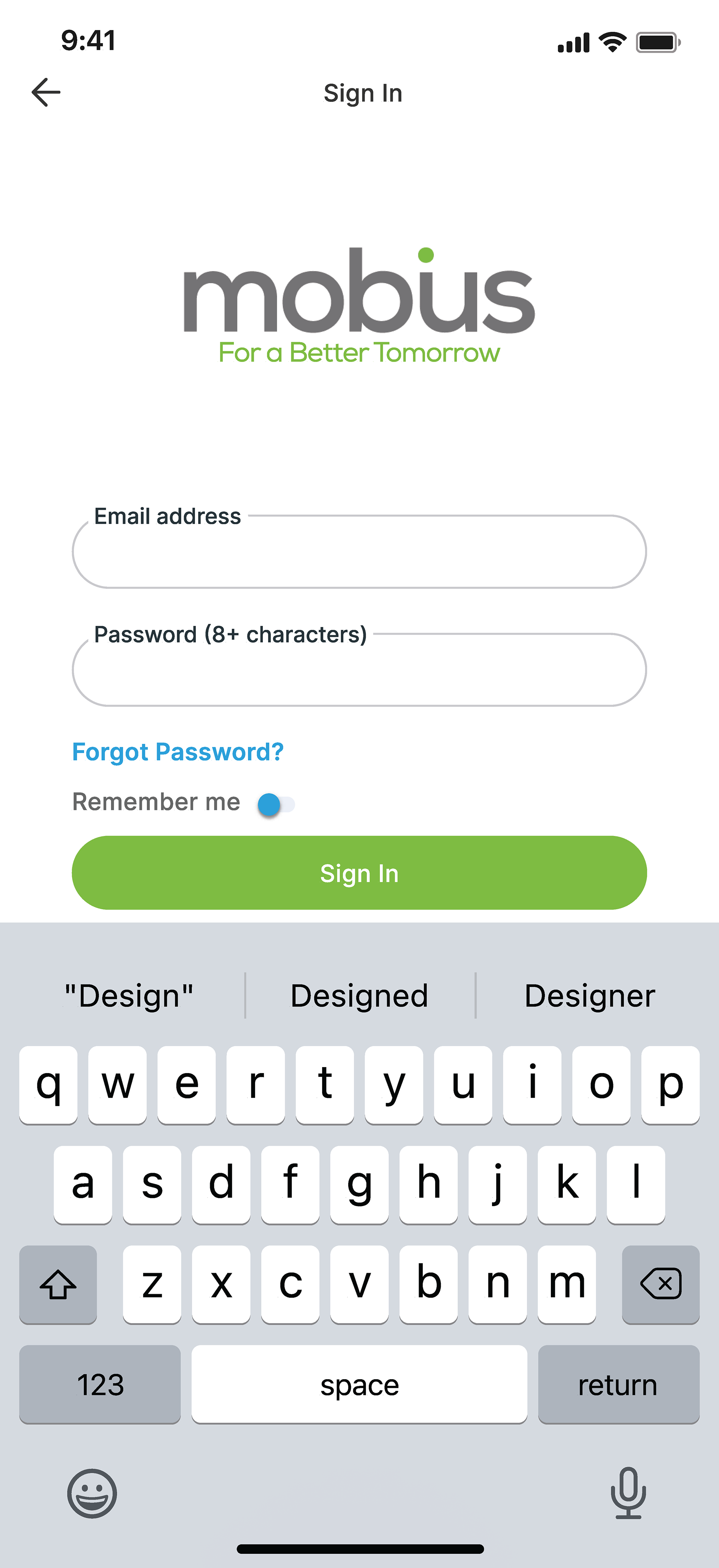
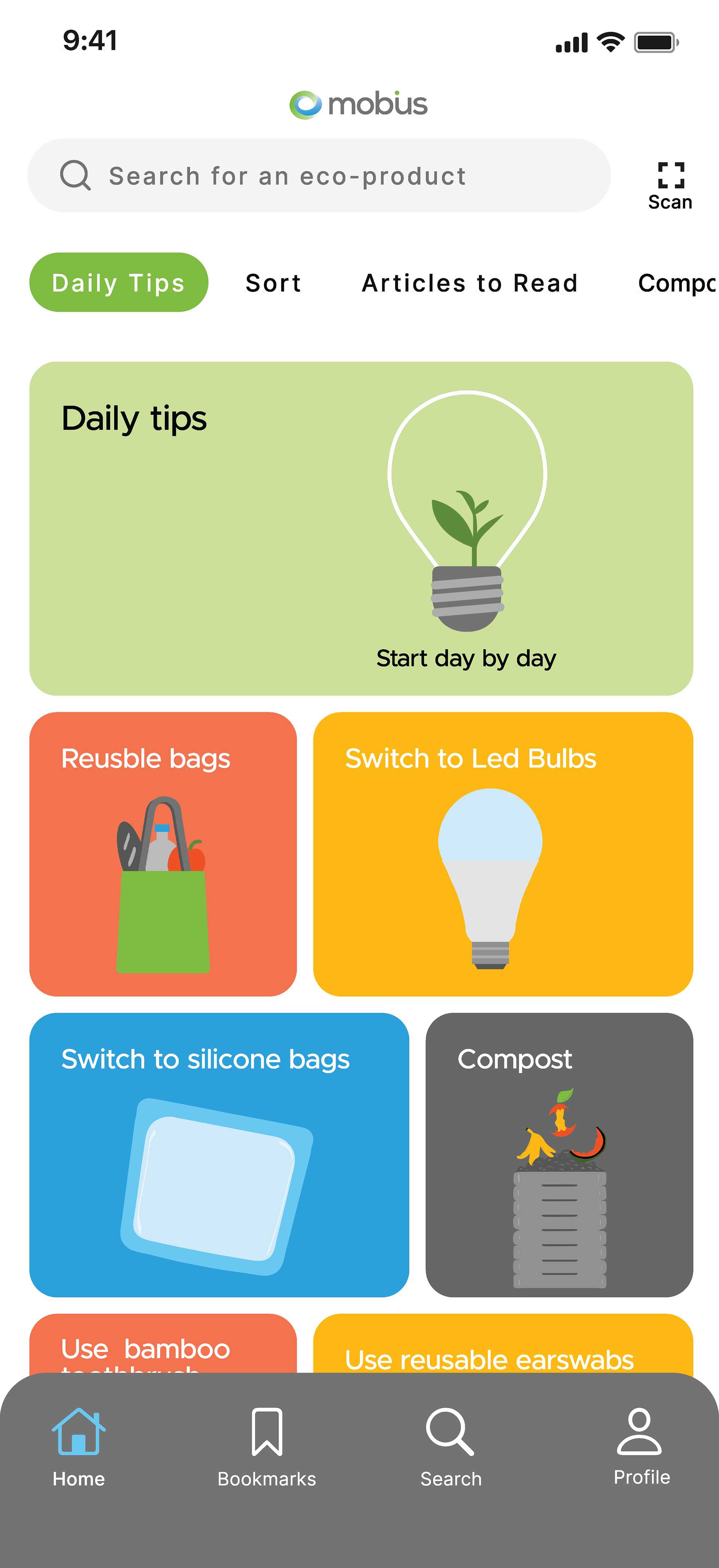
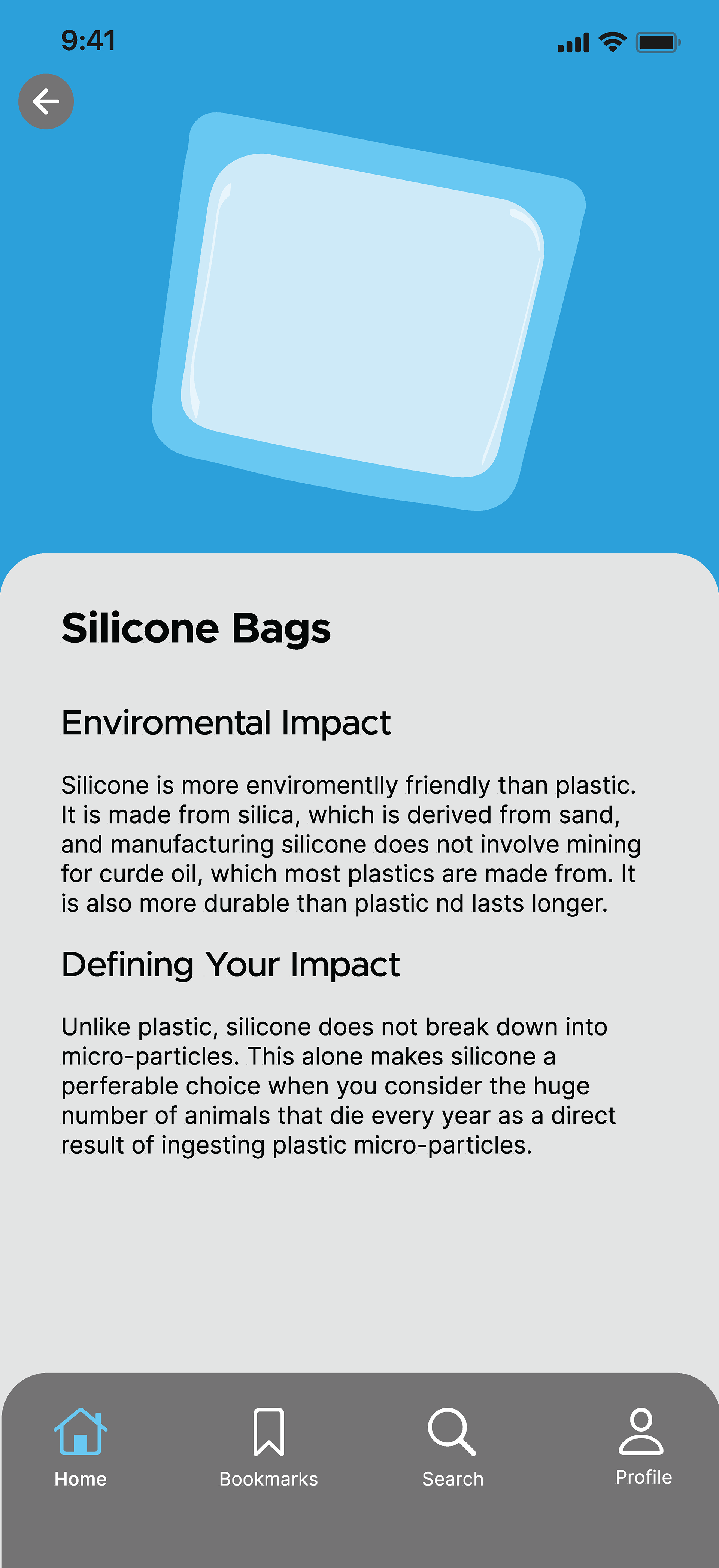
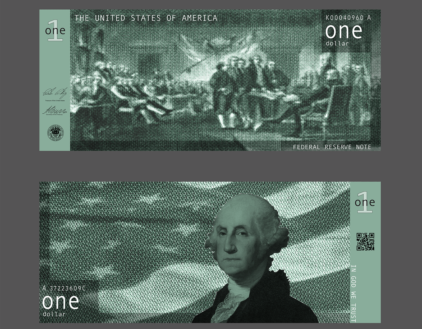
In the United States, only 31.1 percent of waste is recycled; a disturbingly low number. While many people recycle in some capacity, the recycling system in the United States is confusing to most. The public needs to know the correct approach to sorting their waste. We decided to build an approachable mobile application for people to learn about recycling and sustainability. The name Mobius grew from the notion that recycling is not linear, but rather a continuous loop focused on sustainability.
dd
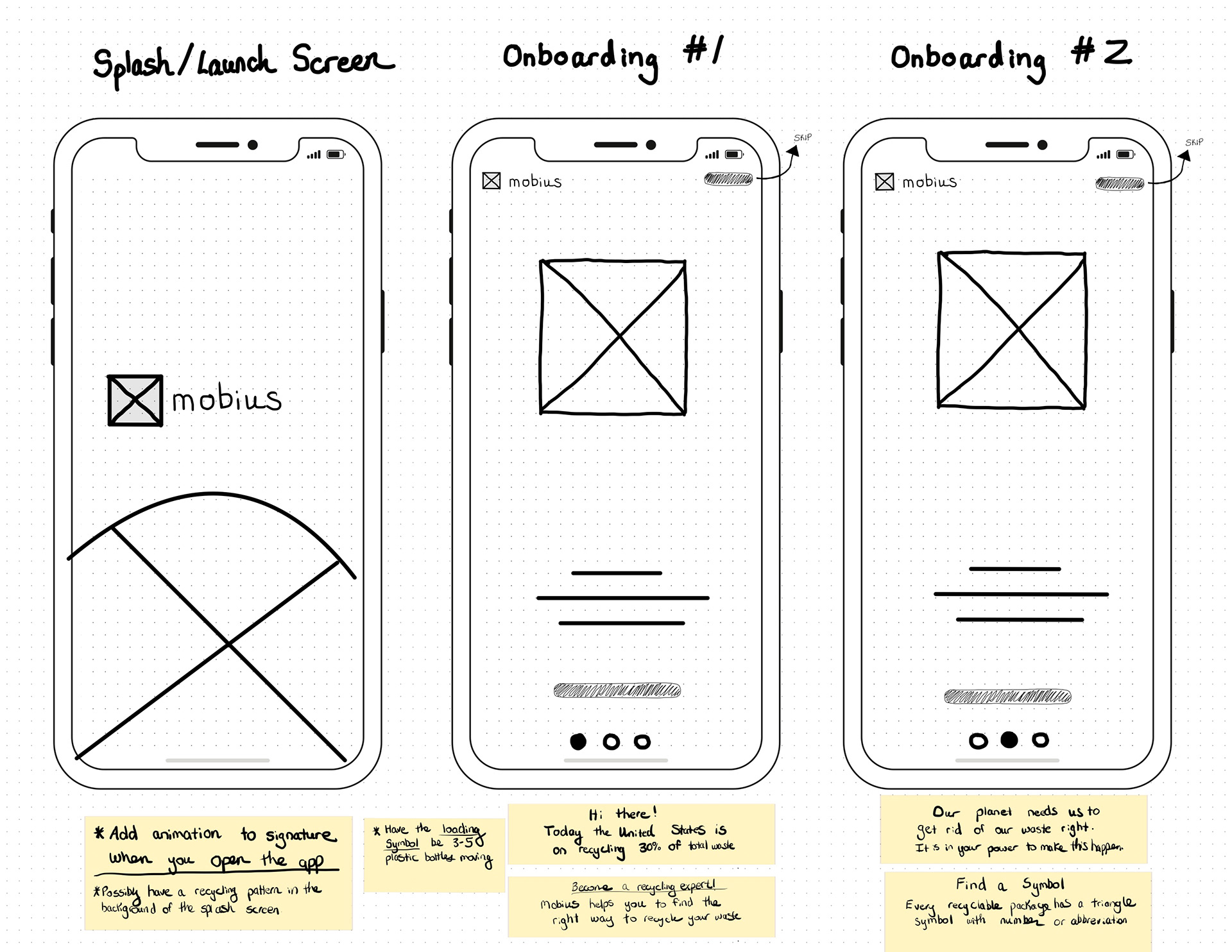
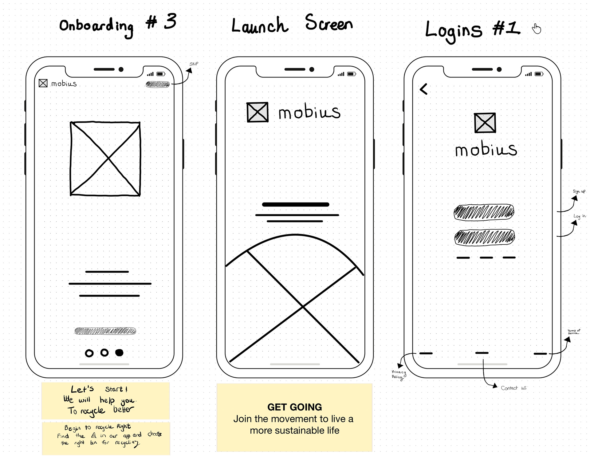
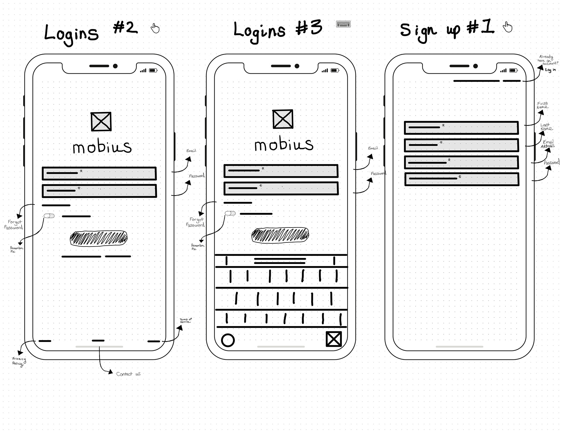
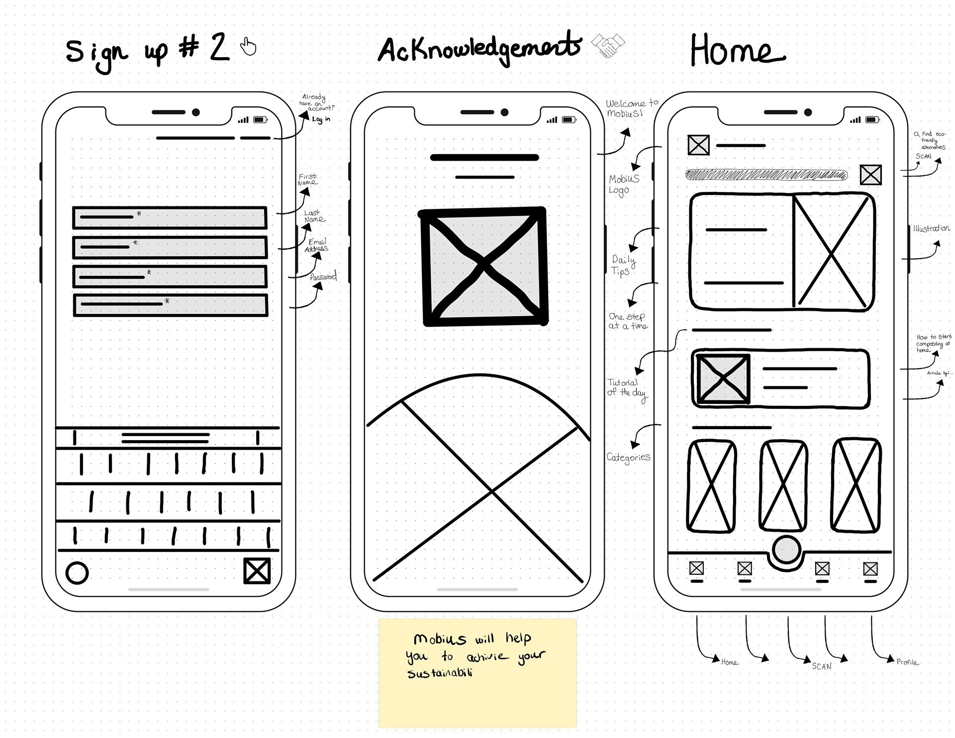
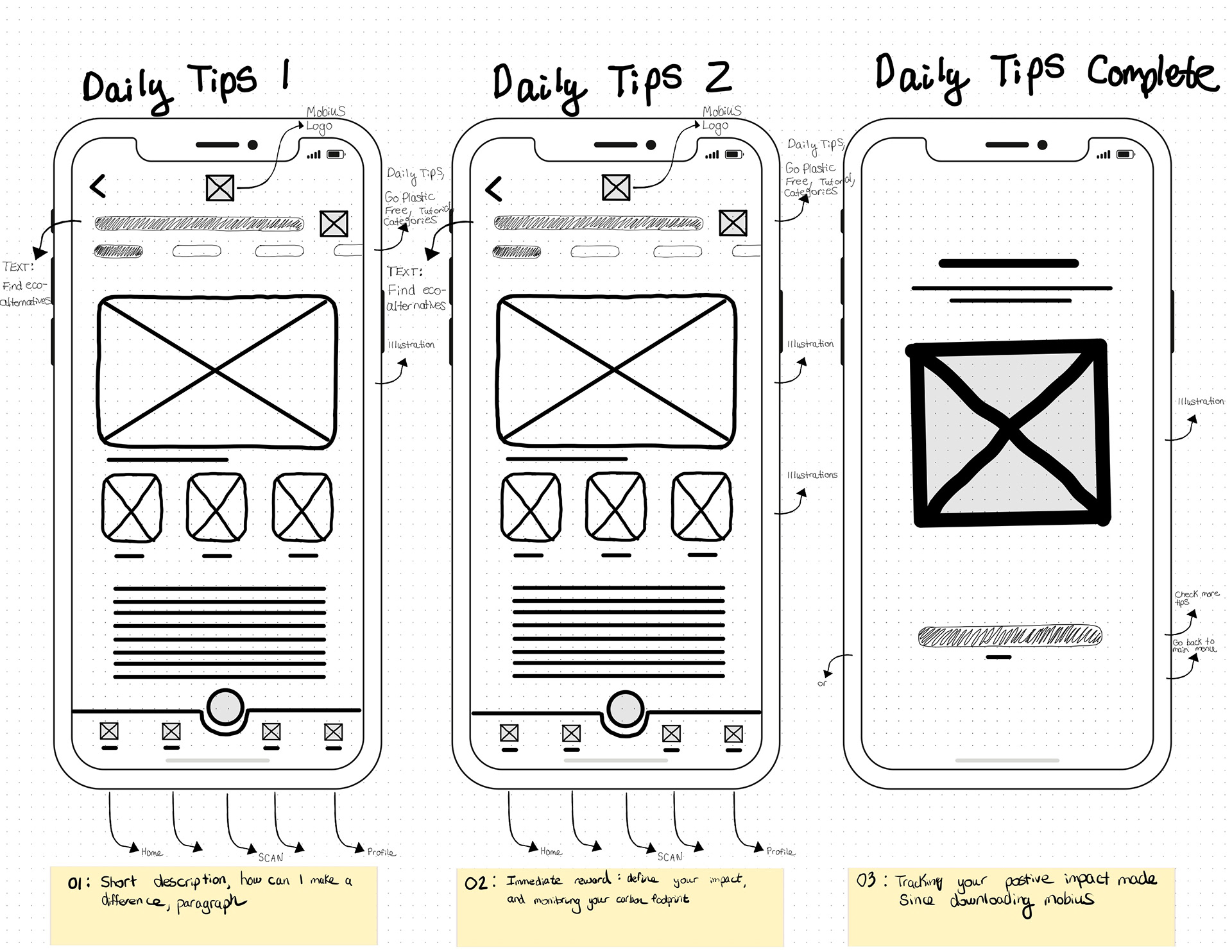
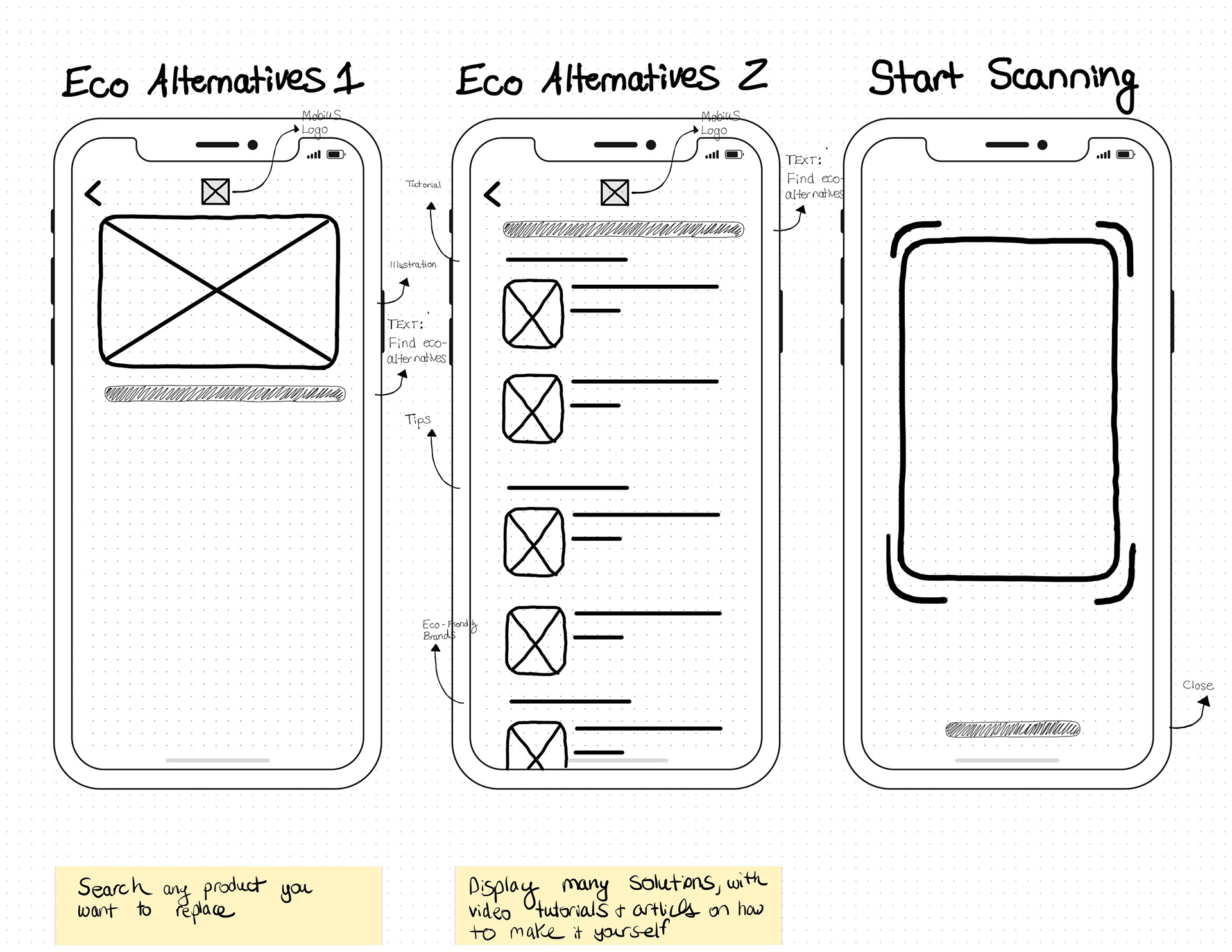
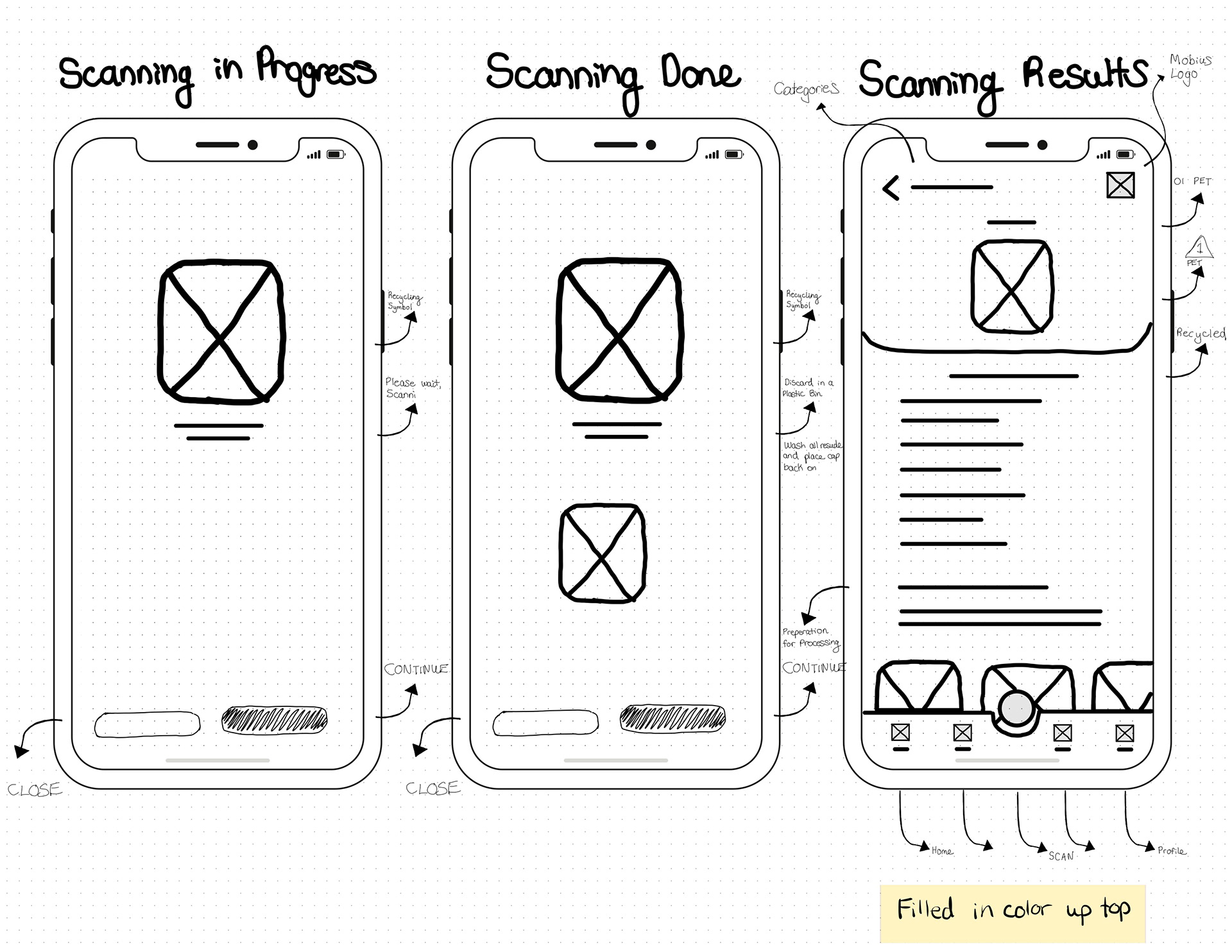
The process of creating the Mobius app is shown through low-fidelity wireframes.
dsds
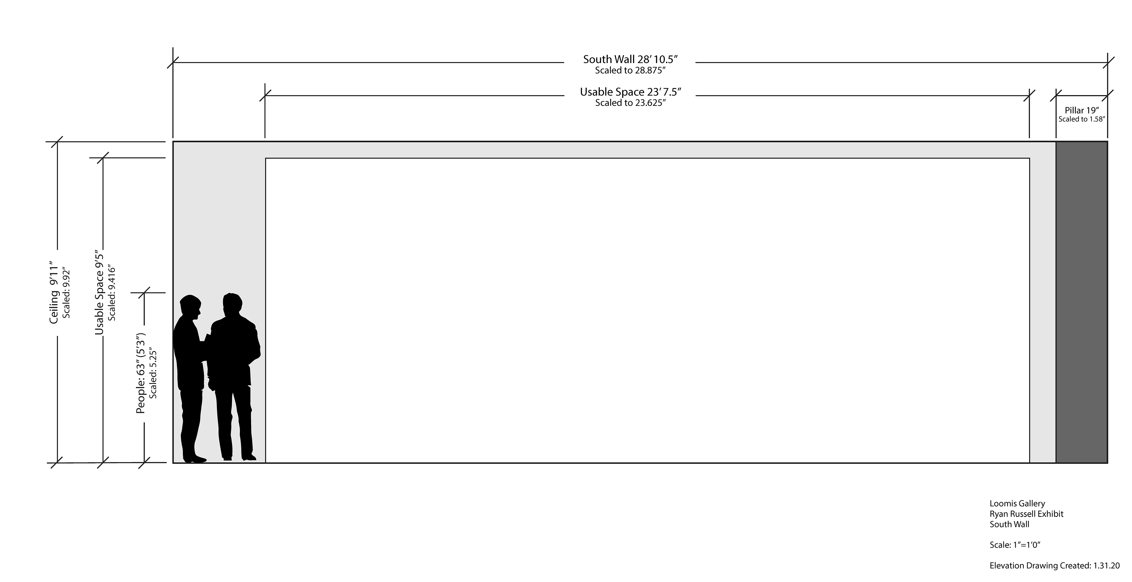
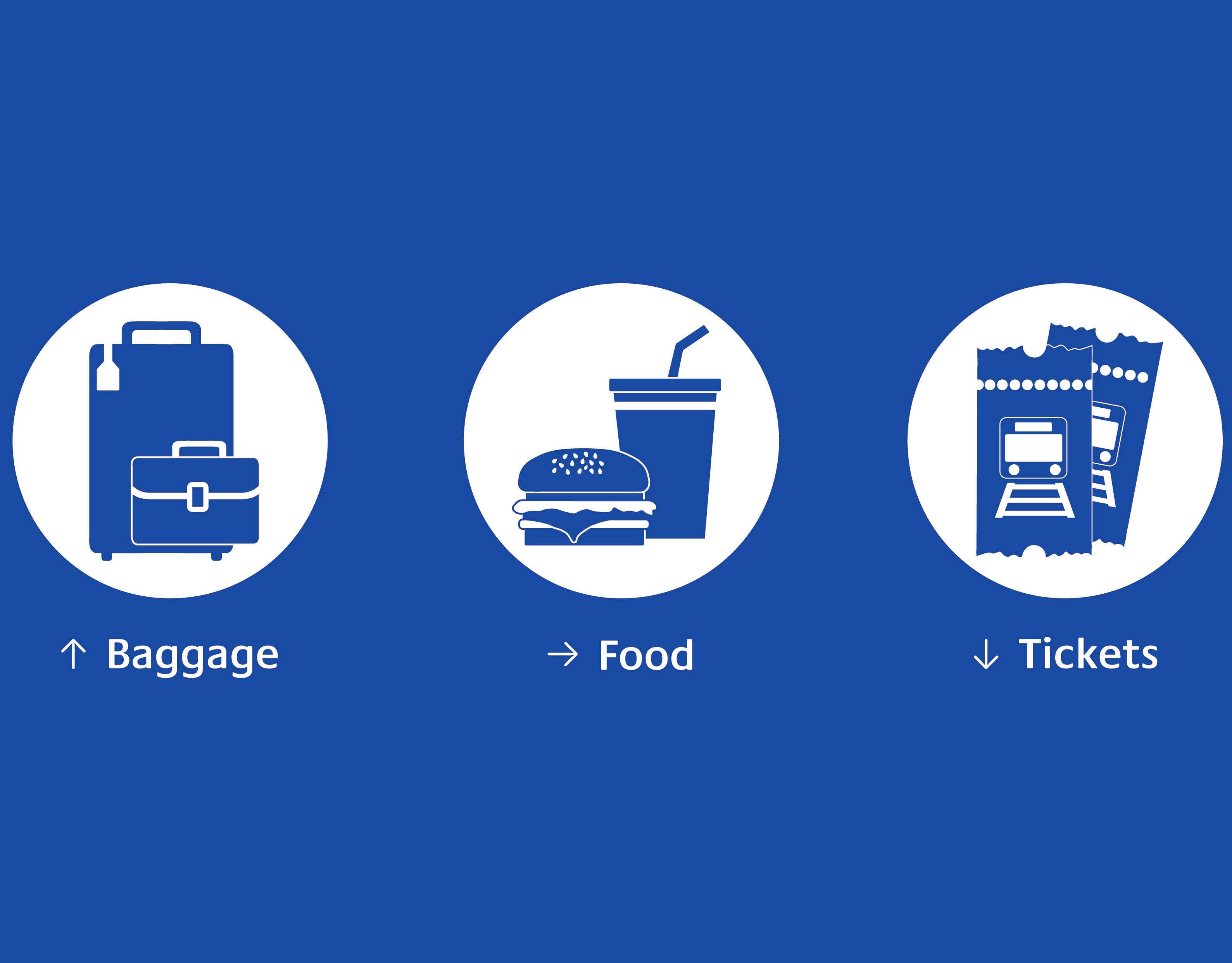
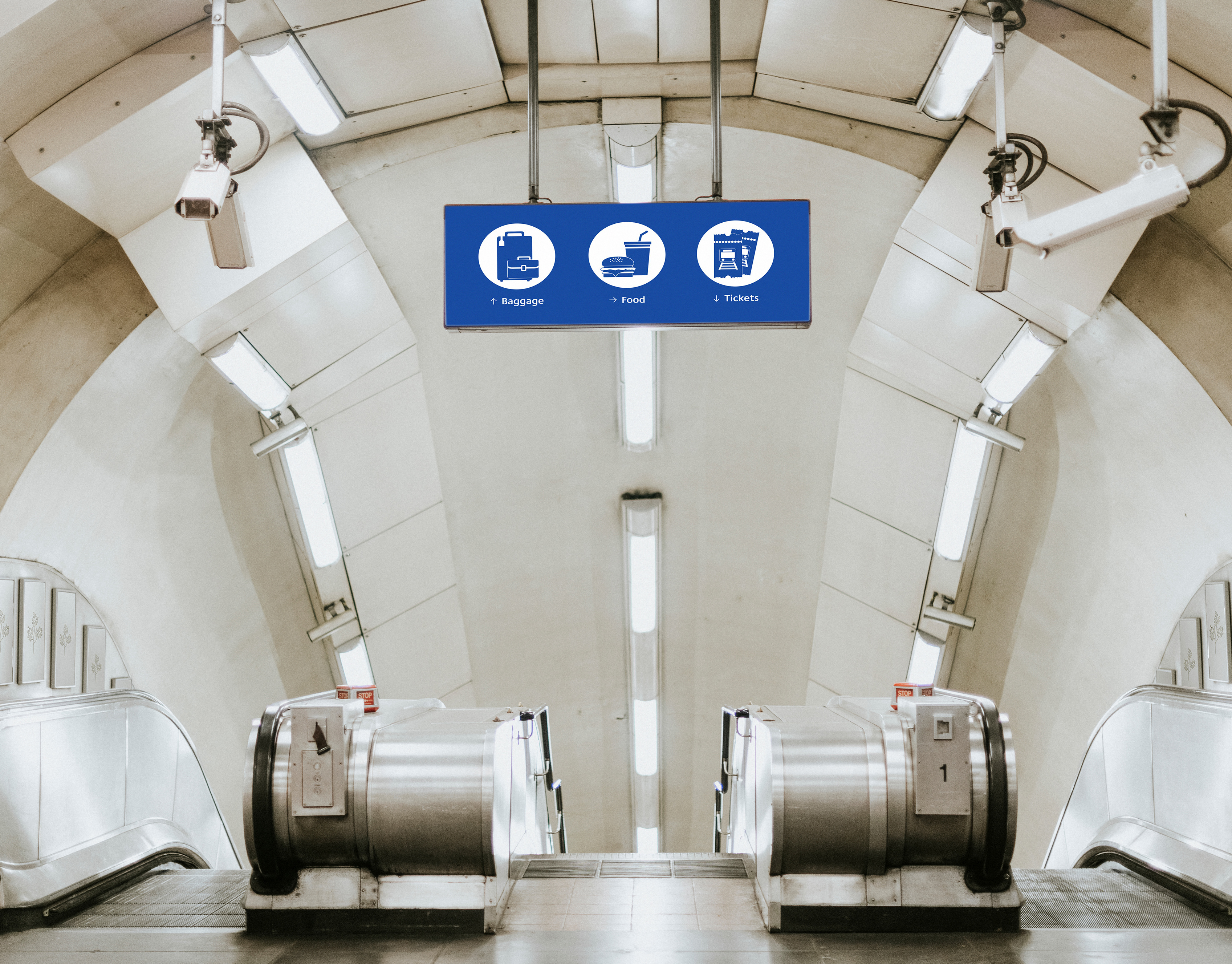
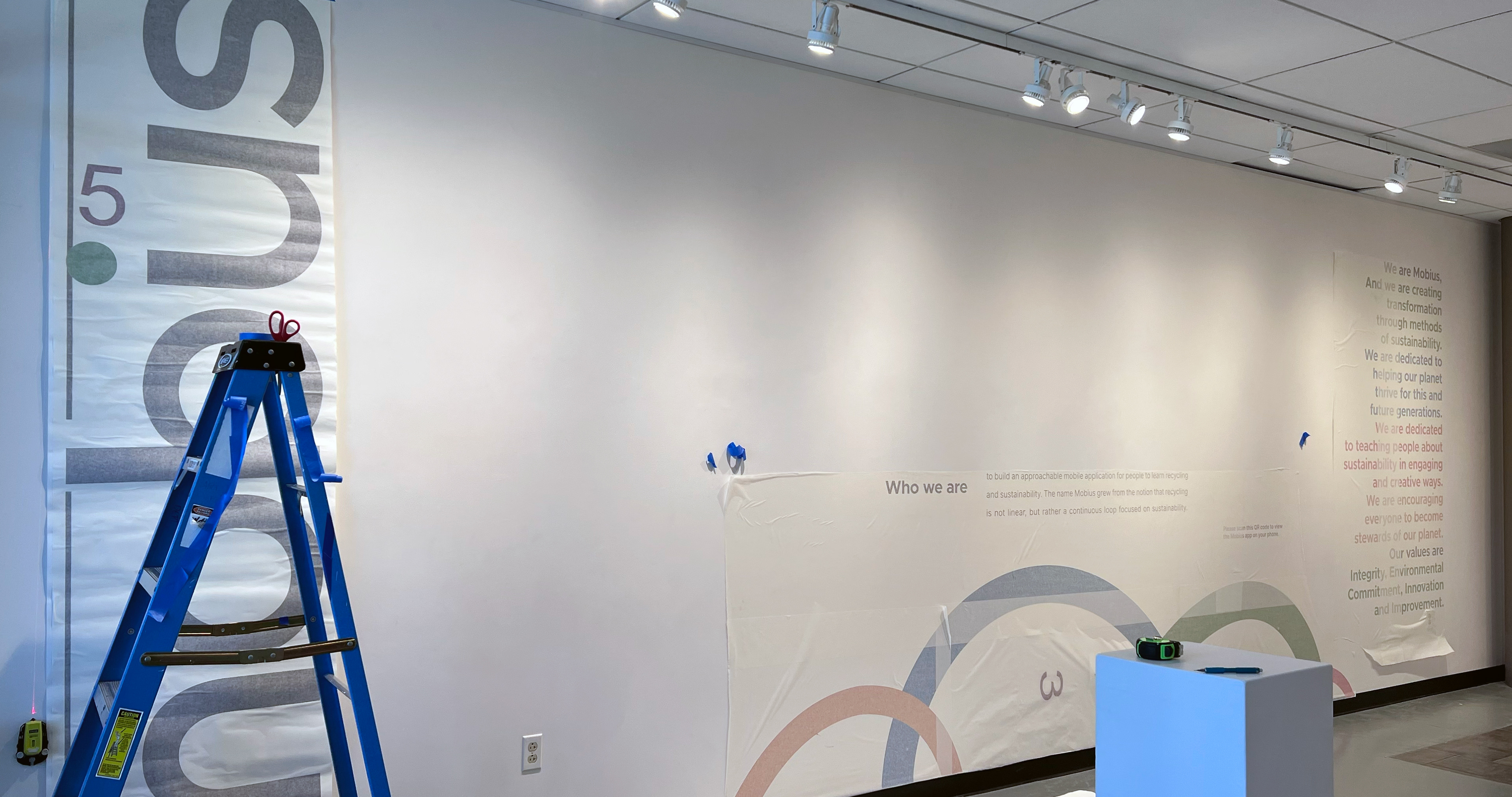
Vinyl Environmental Graphics Displayed in the Loomis Gallery @ Mansfield University.

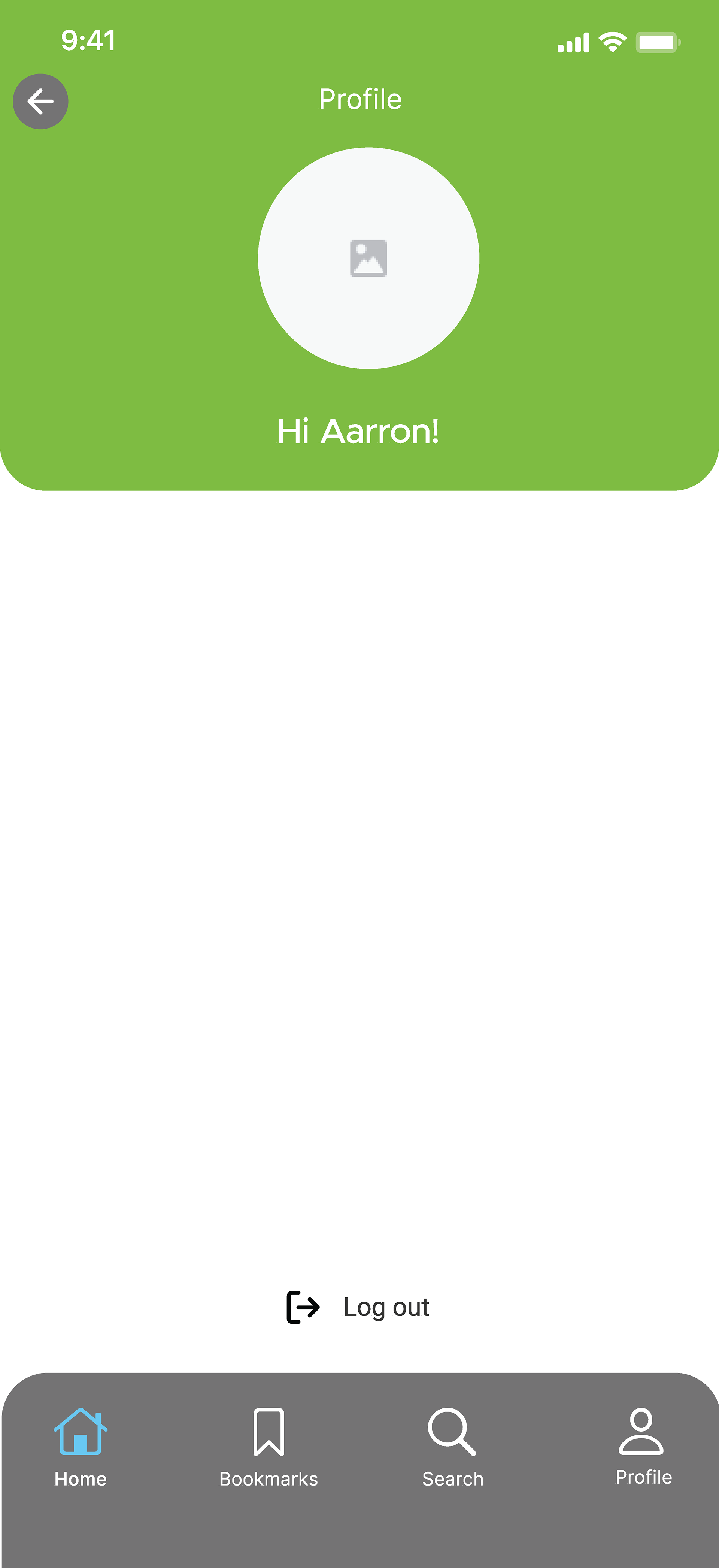
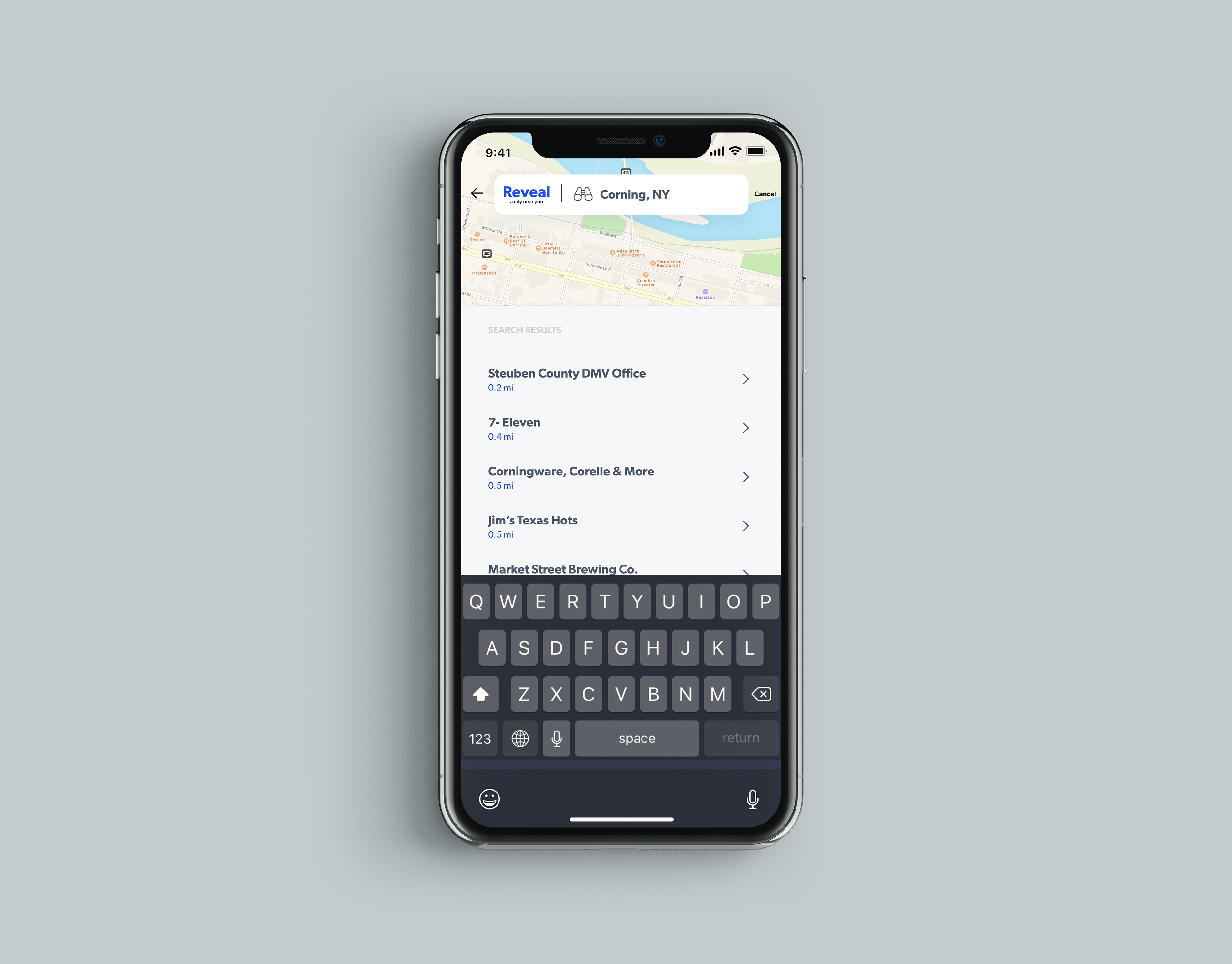
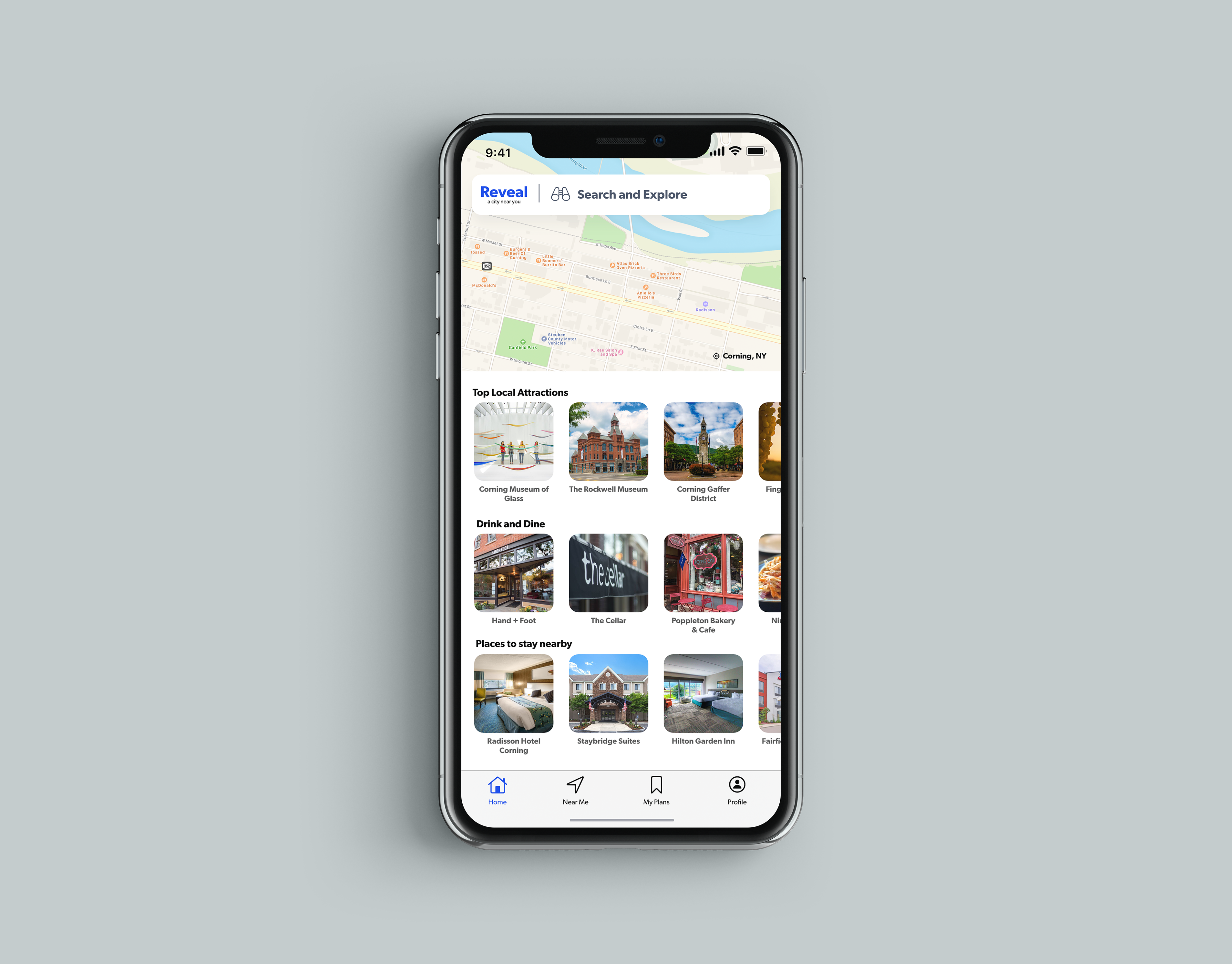
A physical interactive prototype of the Mobius app was displayed so viewers of the Mobius exhibition could interact firsthand with the interface to learn about recycling and sustainability.
An interactive physical prototype of the Mobius app was displayed at the Mobius exhibition, allowing viewers to interact firsthand with the interface and learn about recycling and sustainability.
Process (Sketches & Concepts)
edd