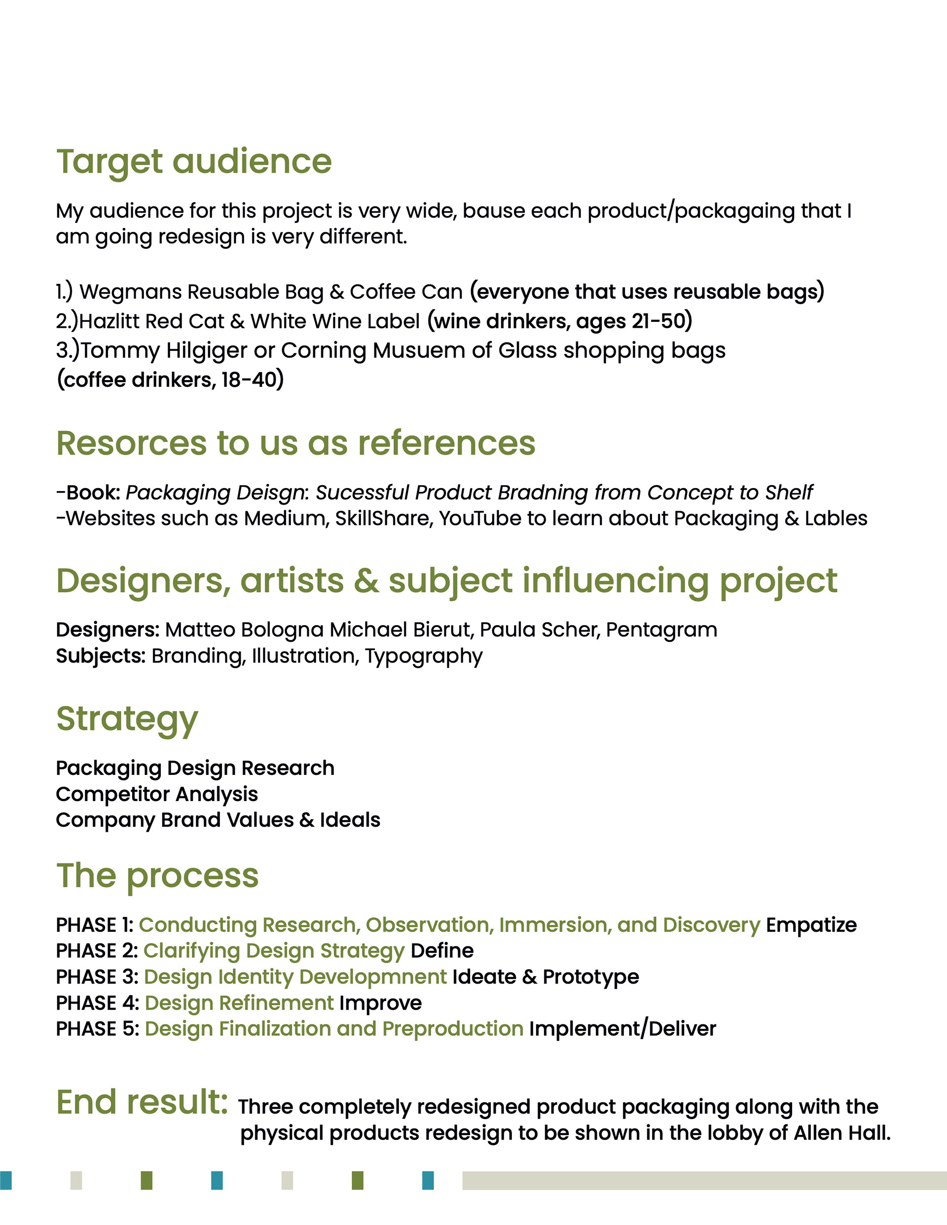
Brand Identity, Packaging, Printmaking, Illustration
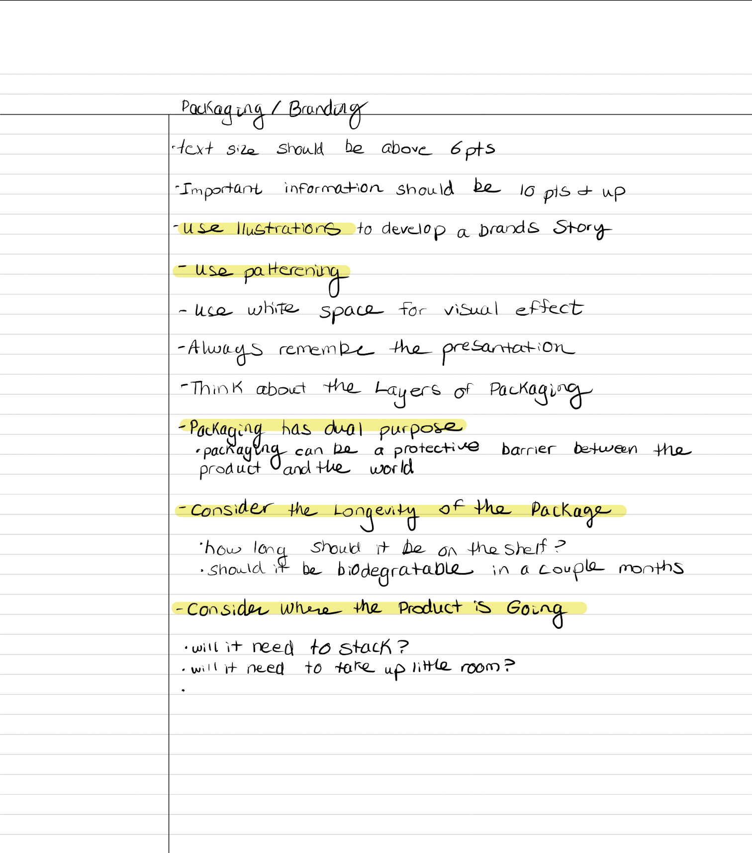
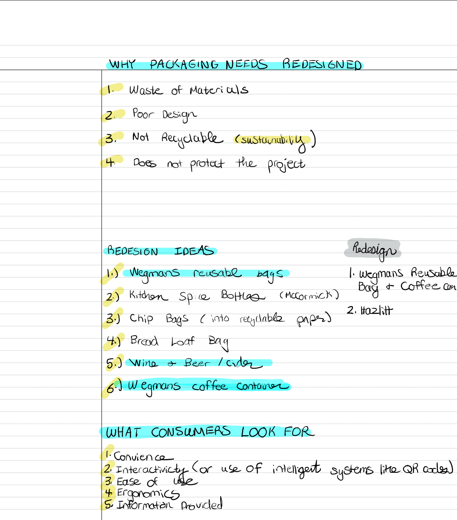
Redesign of six current product packaging to make them more current but maintain a sense of familiarity while still being playful.
ss
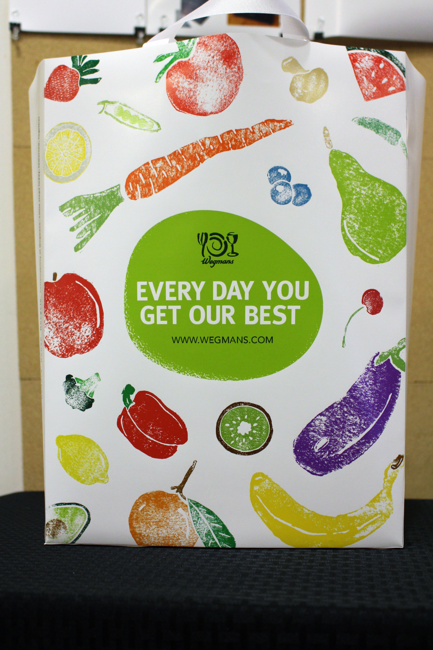
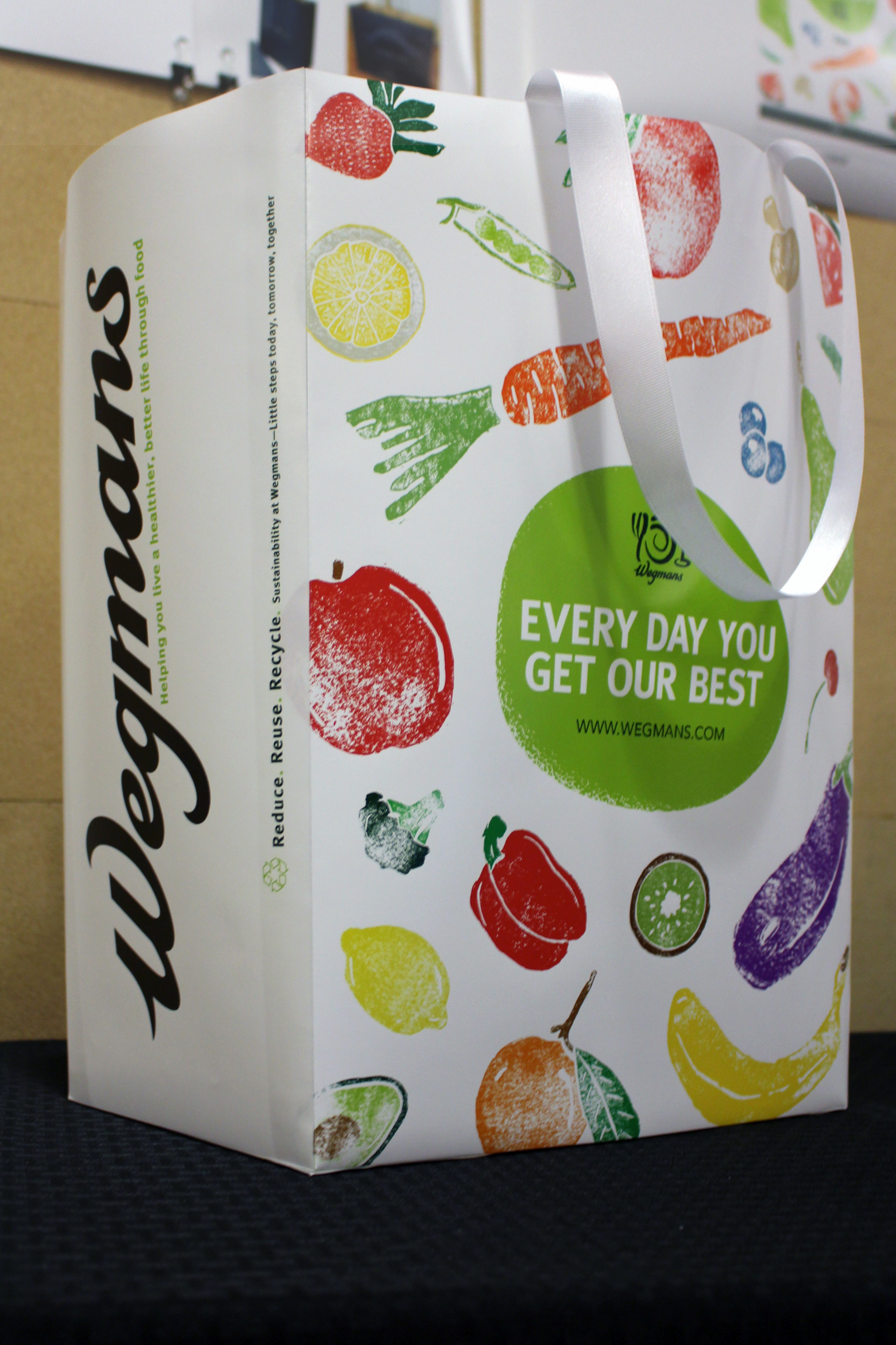
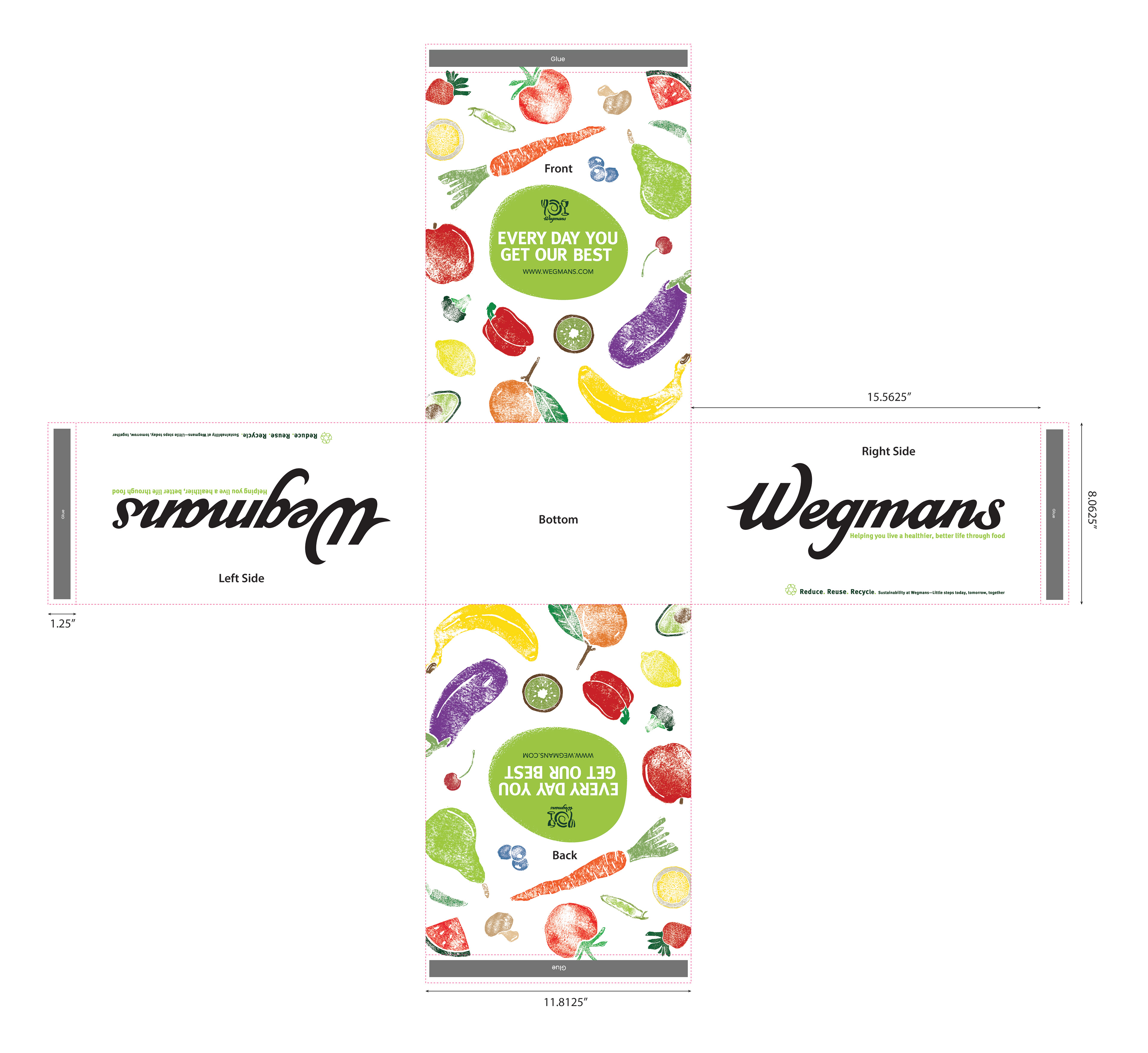
The redesign of the Wegmans reusable bag was inspired by the playfulness of the Wegmans brand identity. Previously the bag included images of fruits and vegetables and the new design is built upon fresh produce made through printmaking.
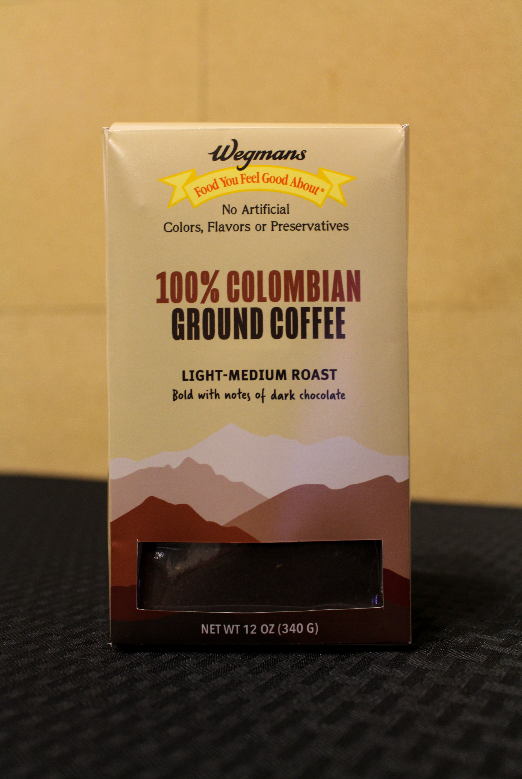


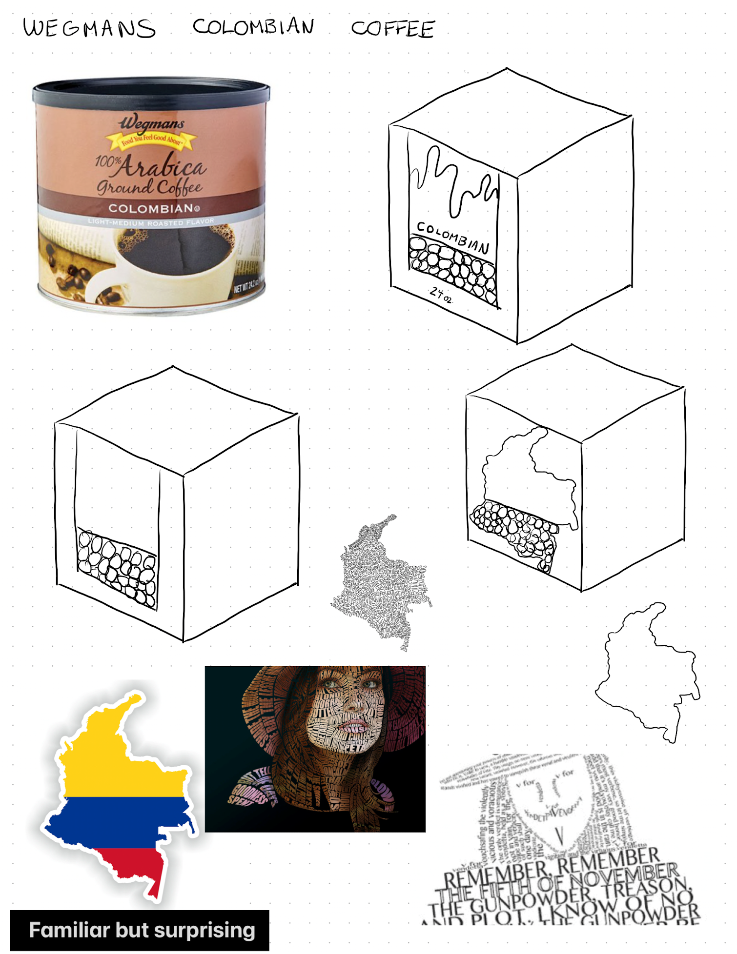
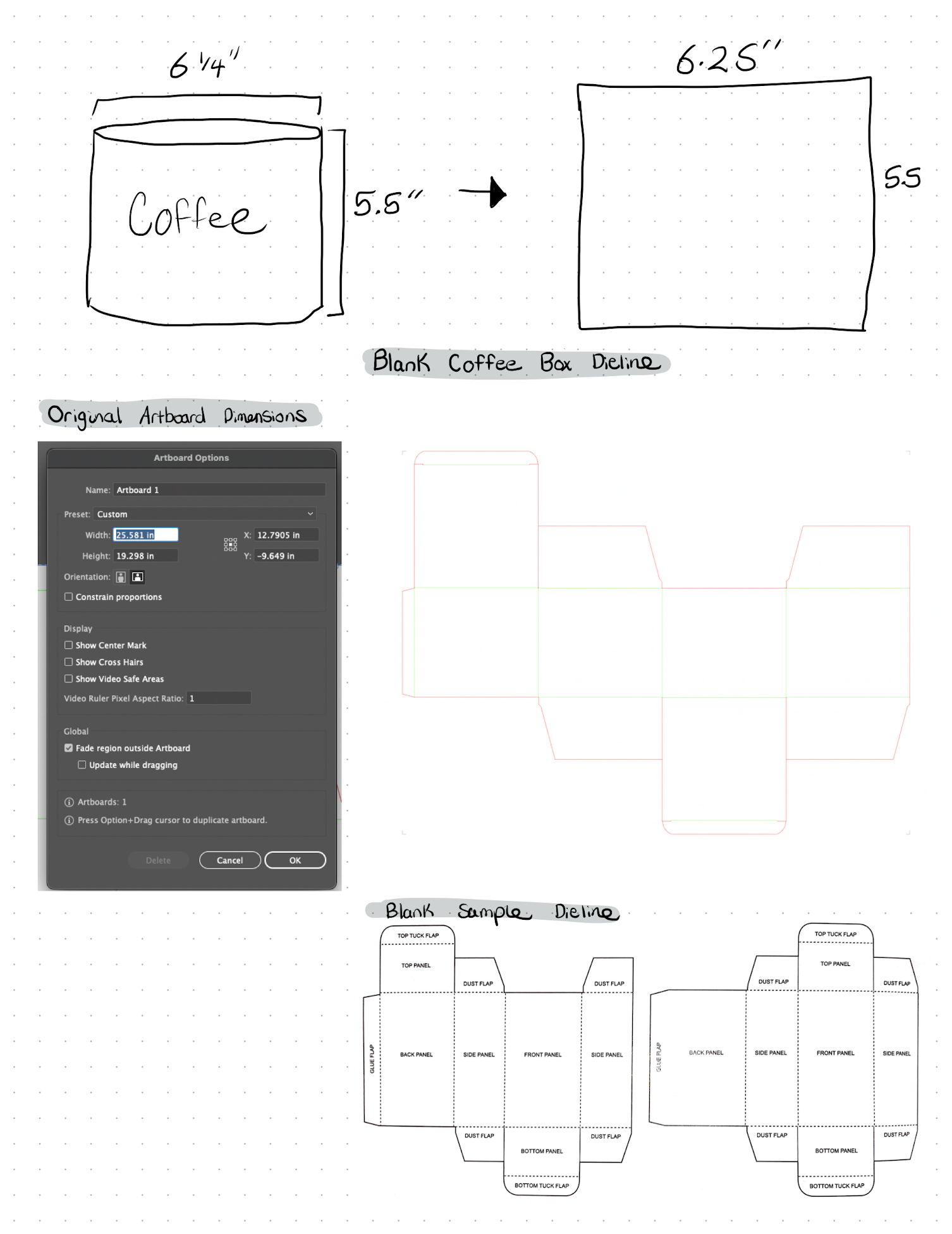
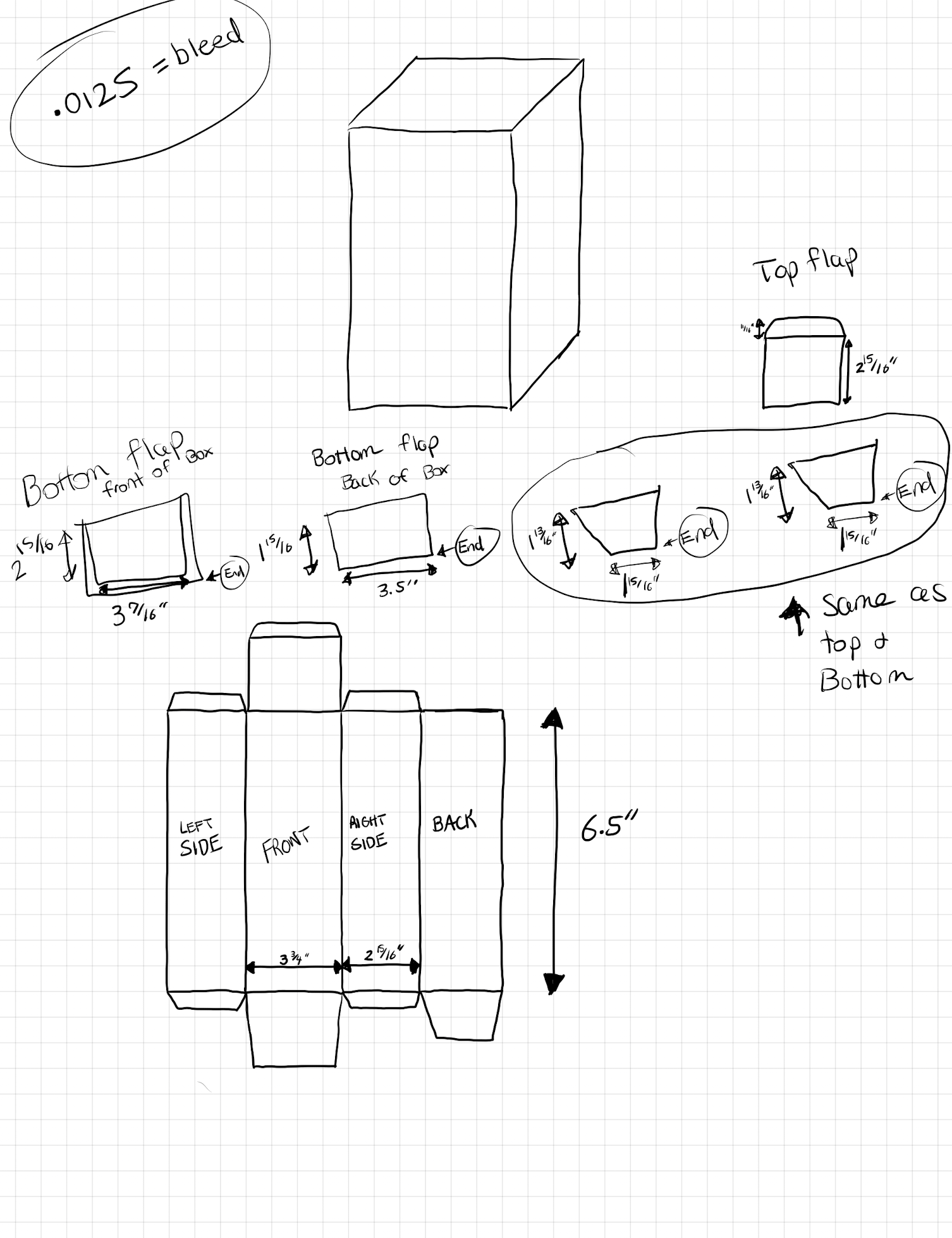
The previous Wegmans Colombian coffee container was round and not recyclable. The new design of the Colombian coffee container is a cardboard box to make the container more sustainable. The illustration is more updated than the product photography from the original design.
The redesign of the Wegmans reusable Colombian Ground Coffee container was created based on the idea of creating a more sustainable package, while still staying true to the original design, but putting a modern spin on it.


fcffff
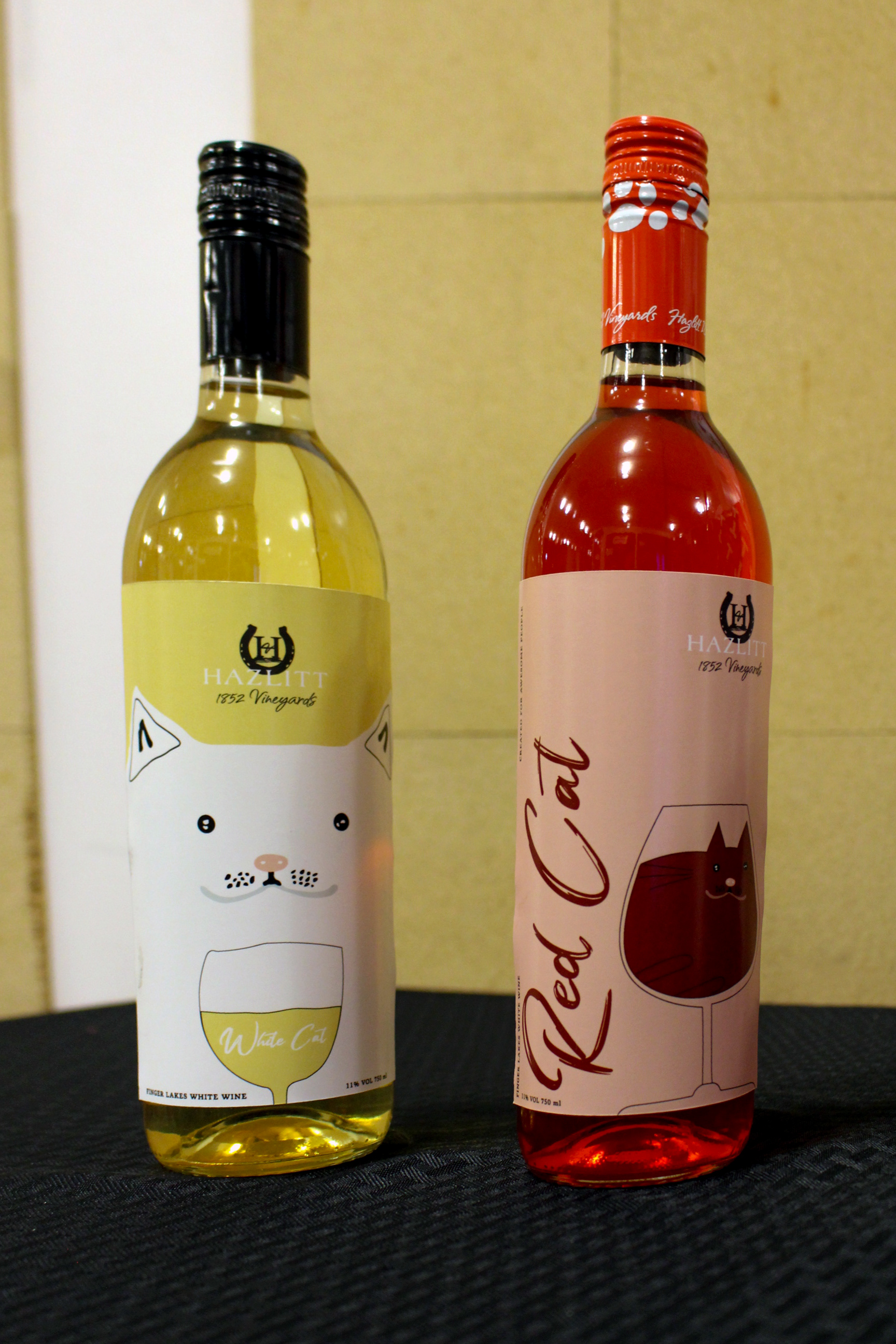
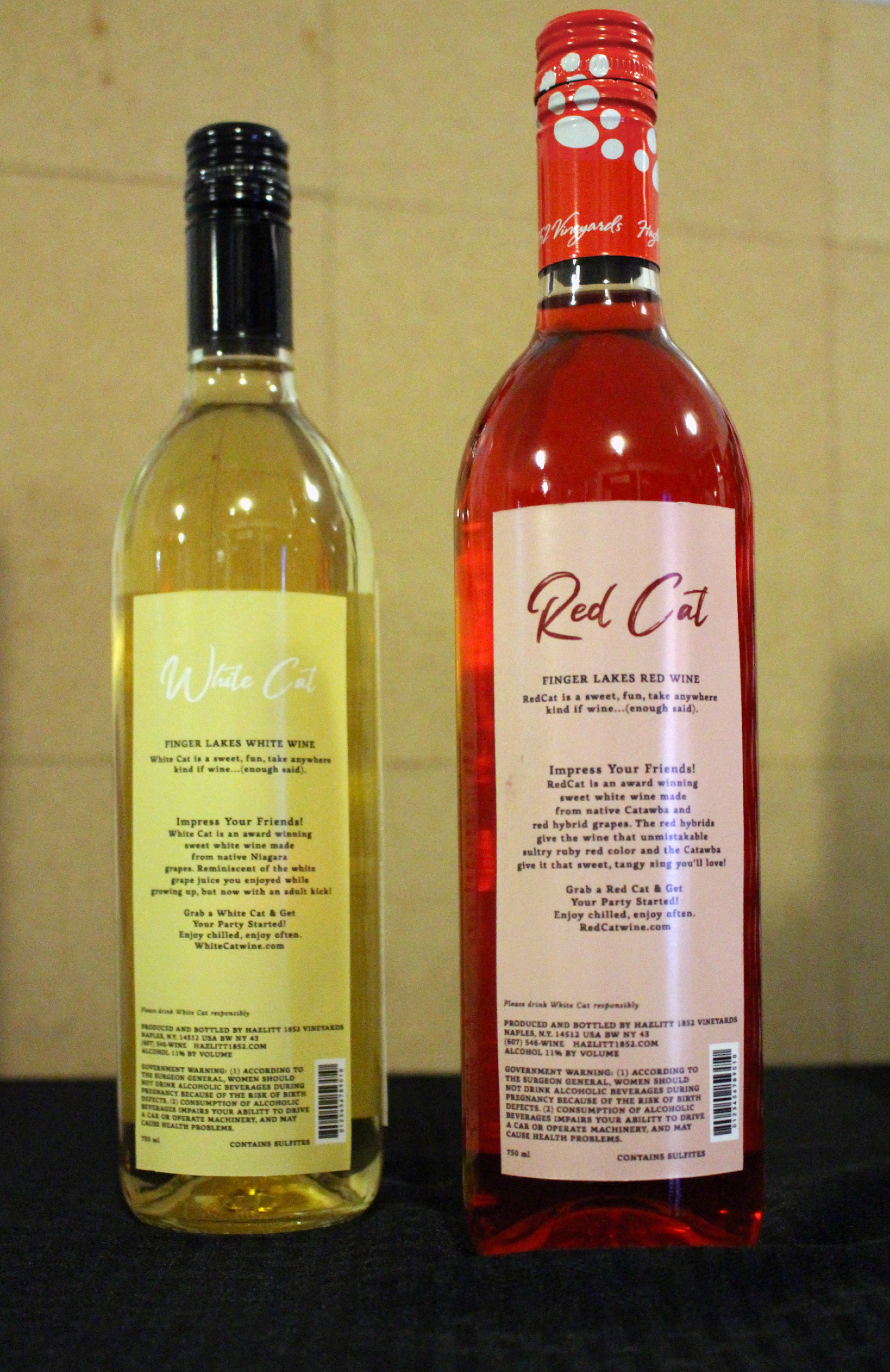
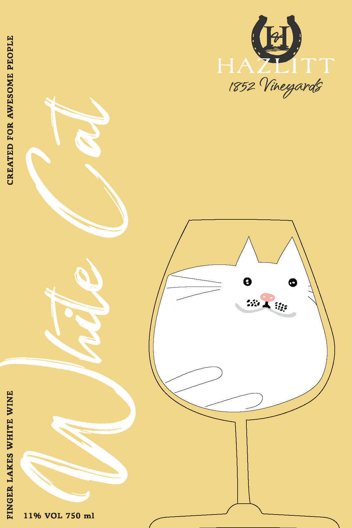
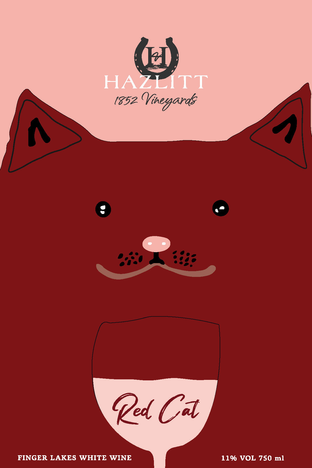
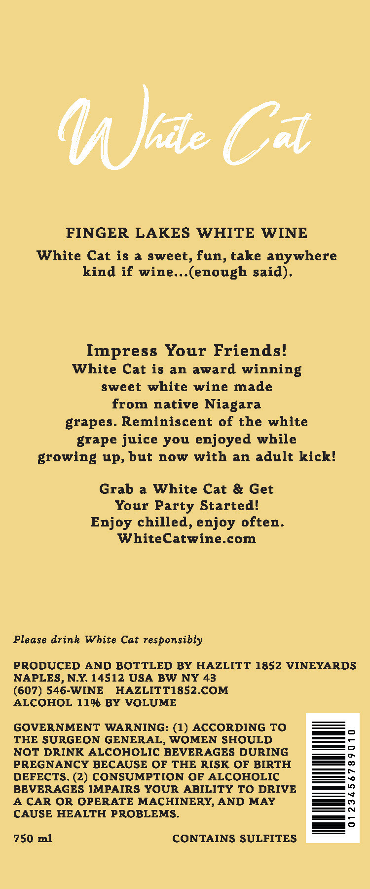
The previous Hazlitt Red and White Cat wine label branding was very outdated. The idea for the new label deisgn was to do a very simple illustative—almost child like art.
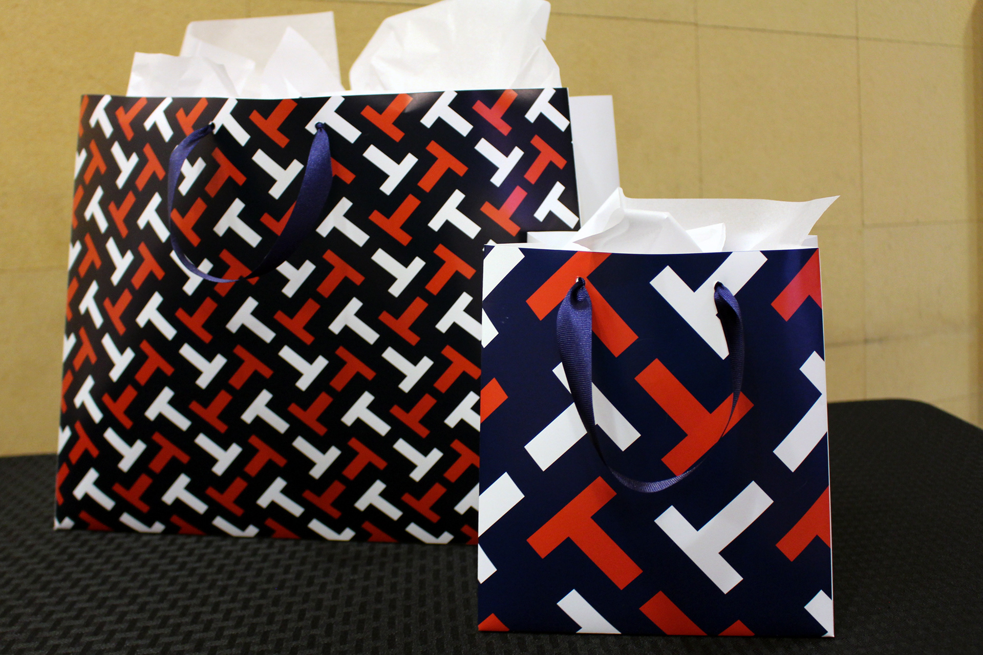
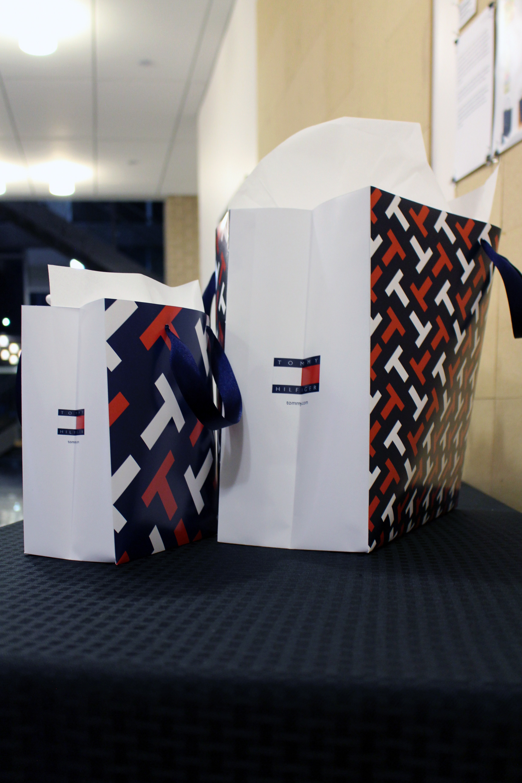
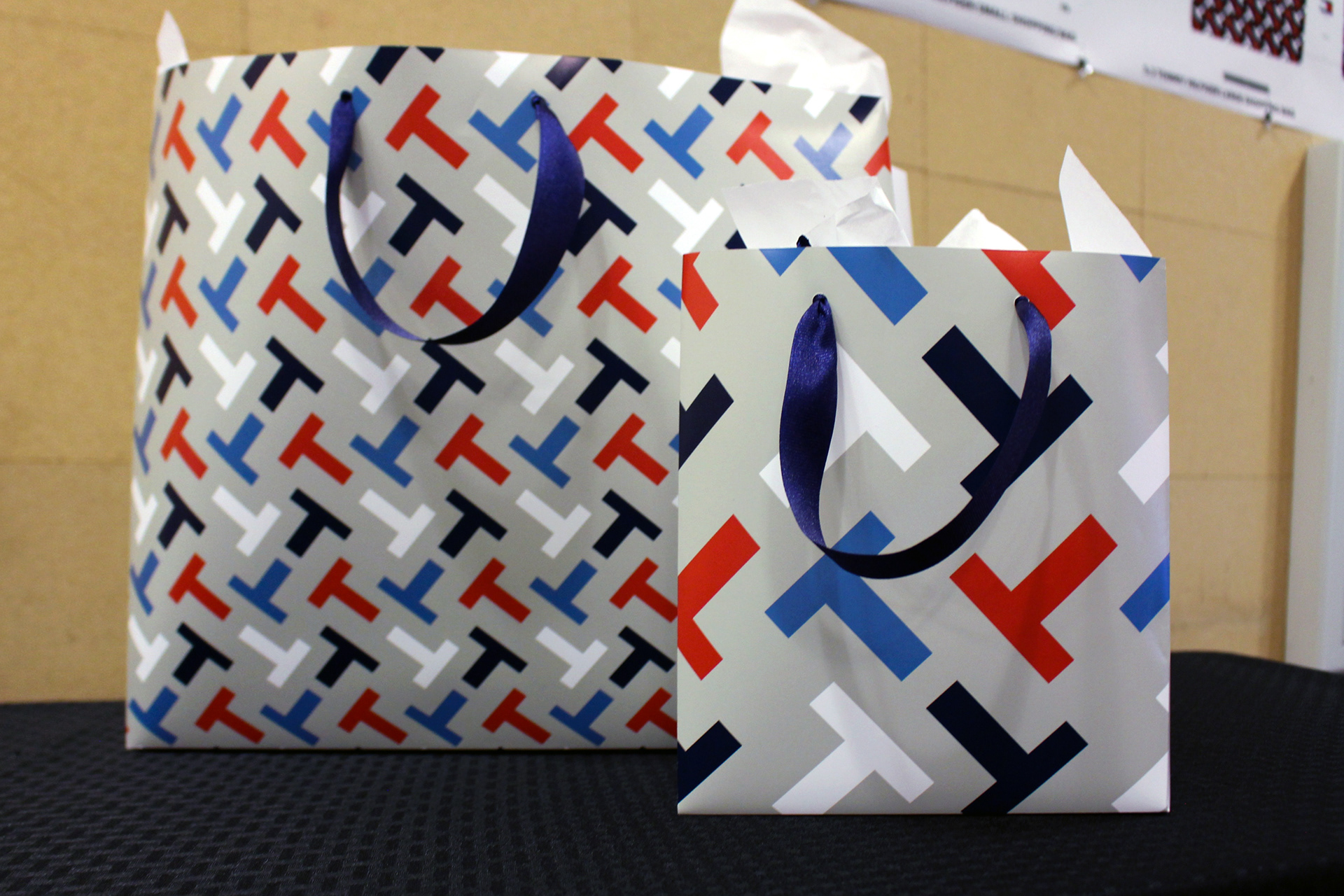
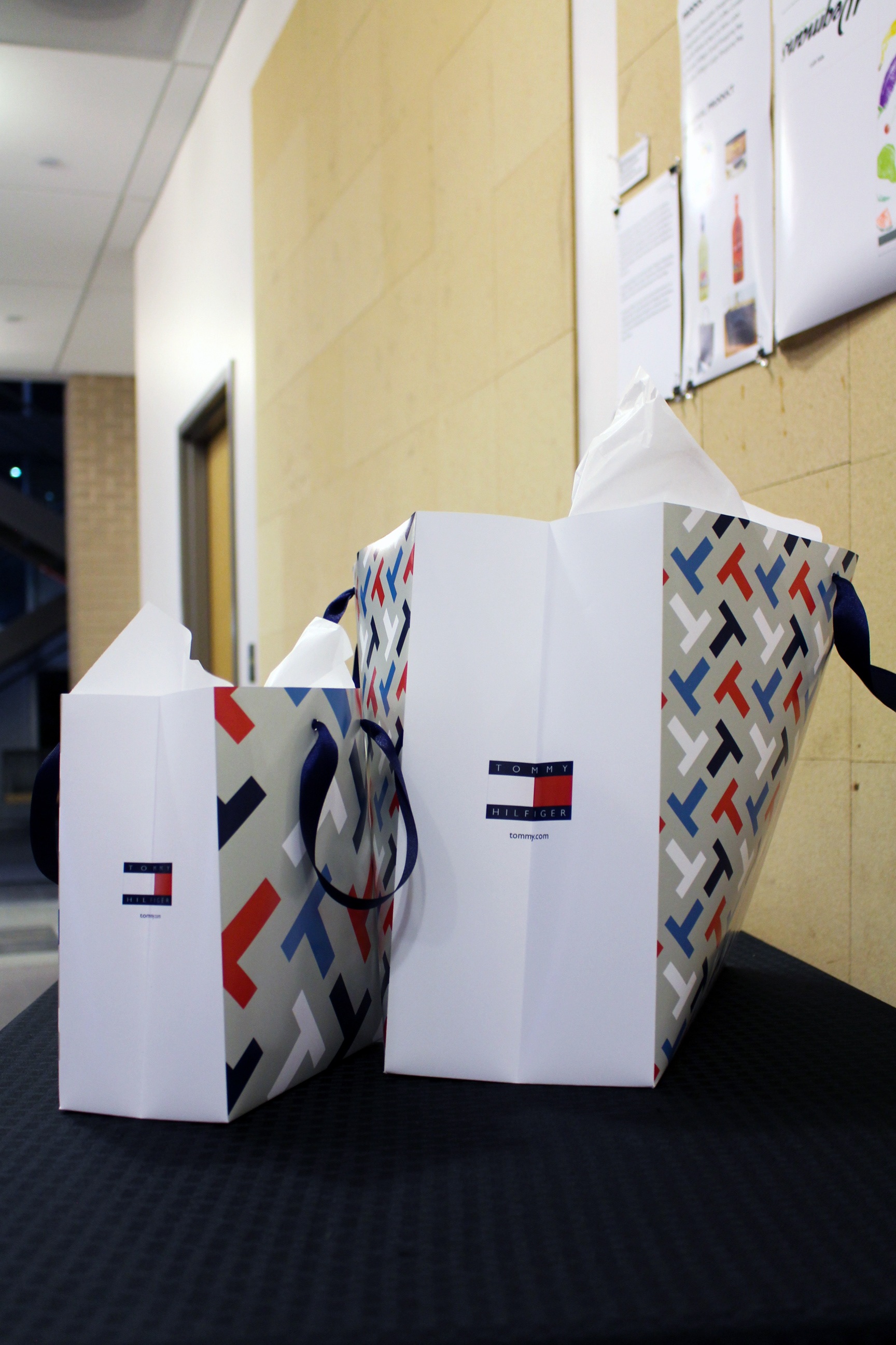
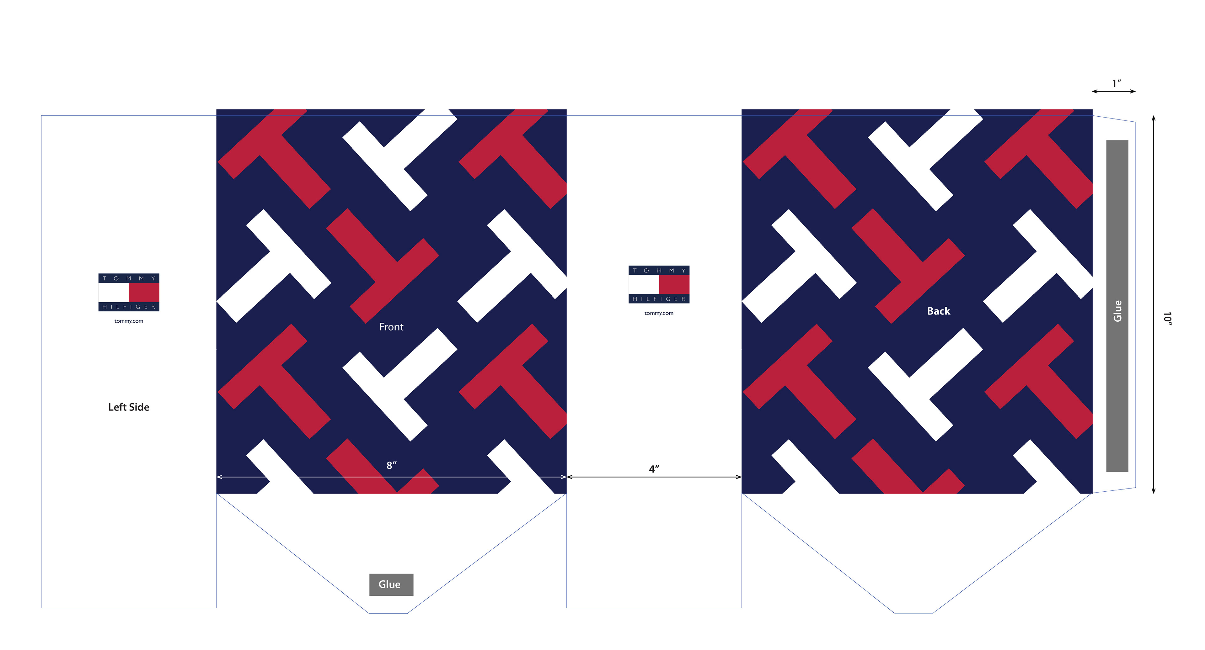
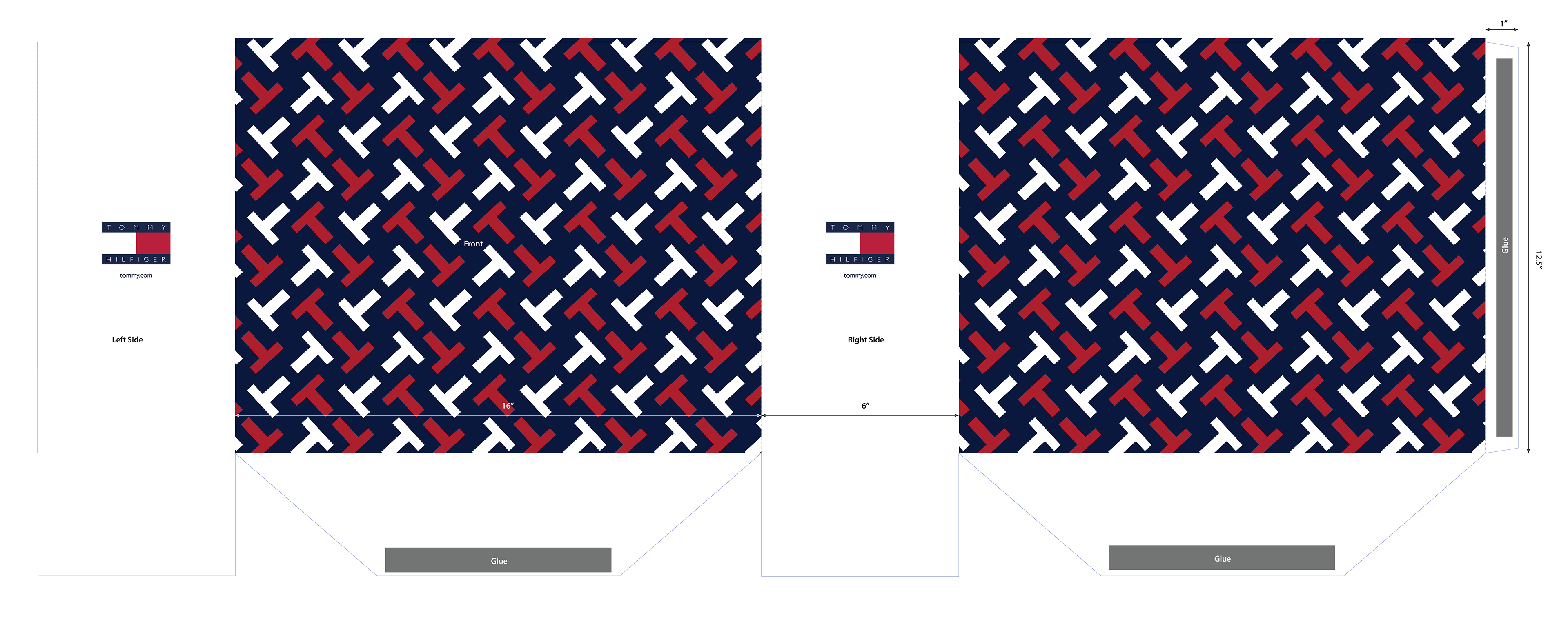
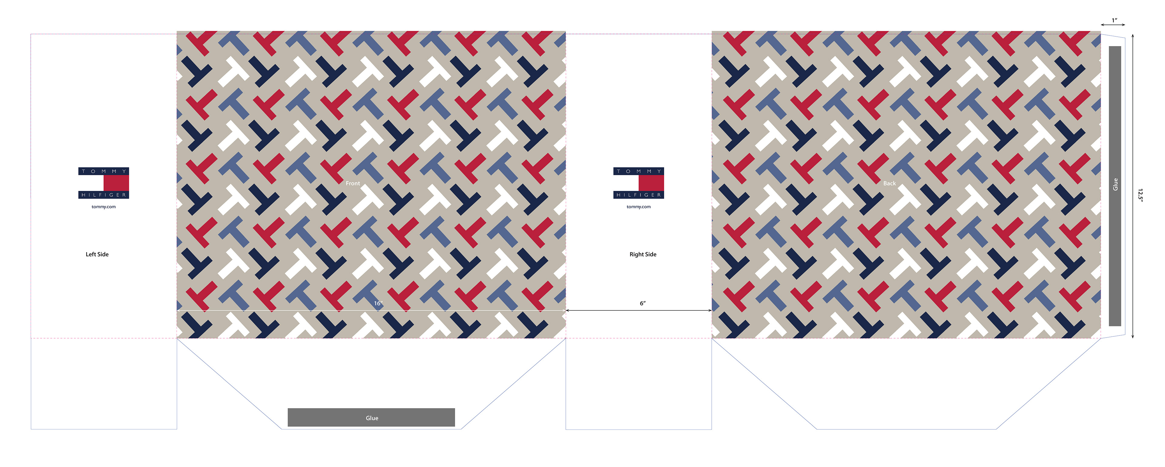
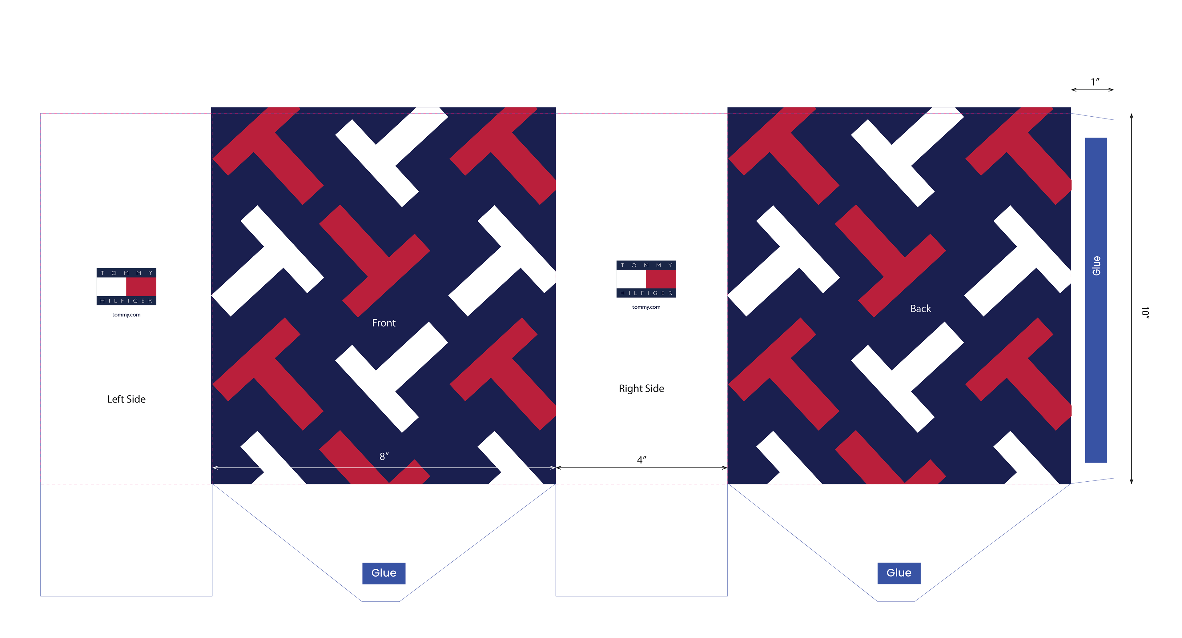
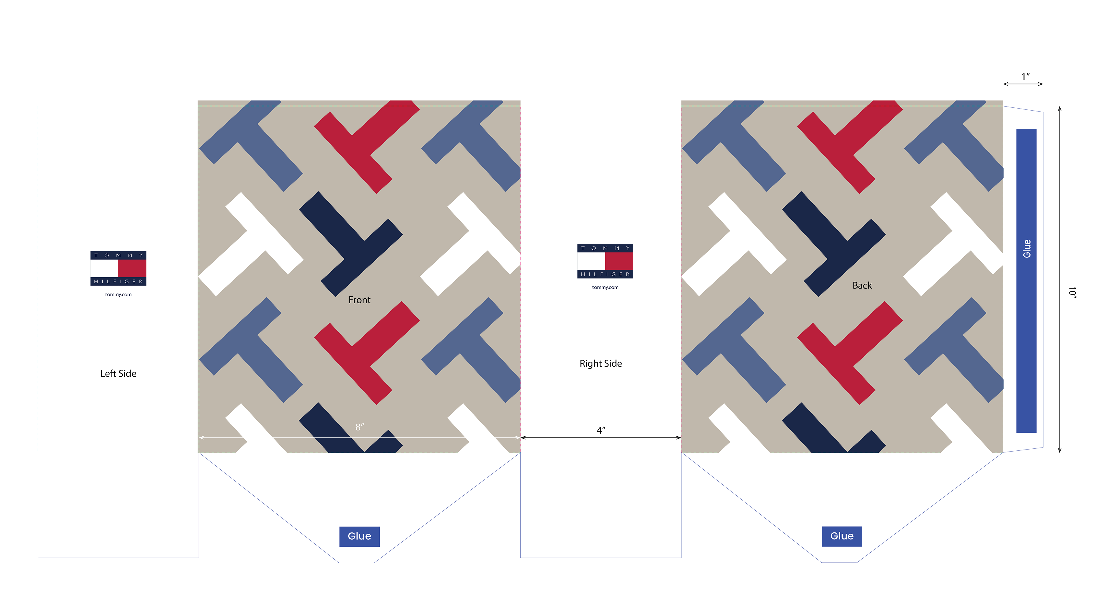
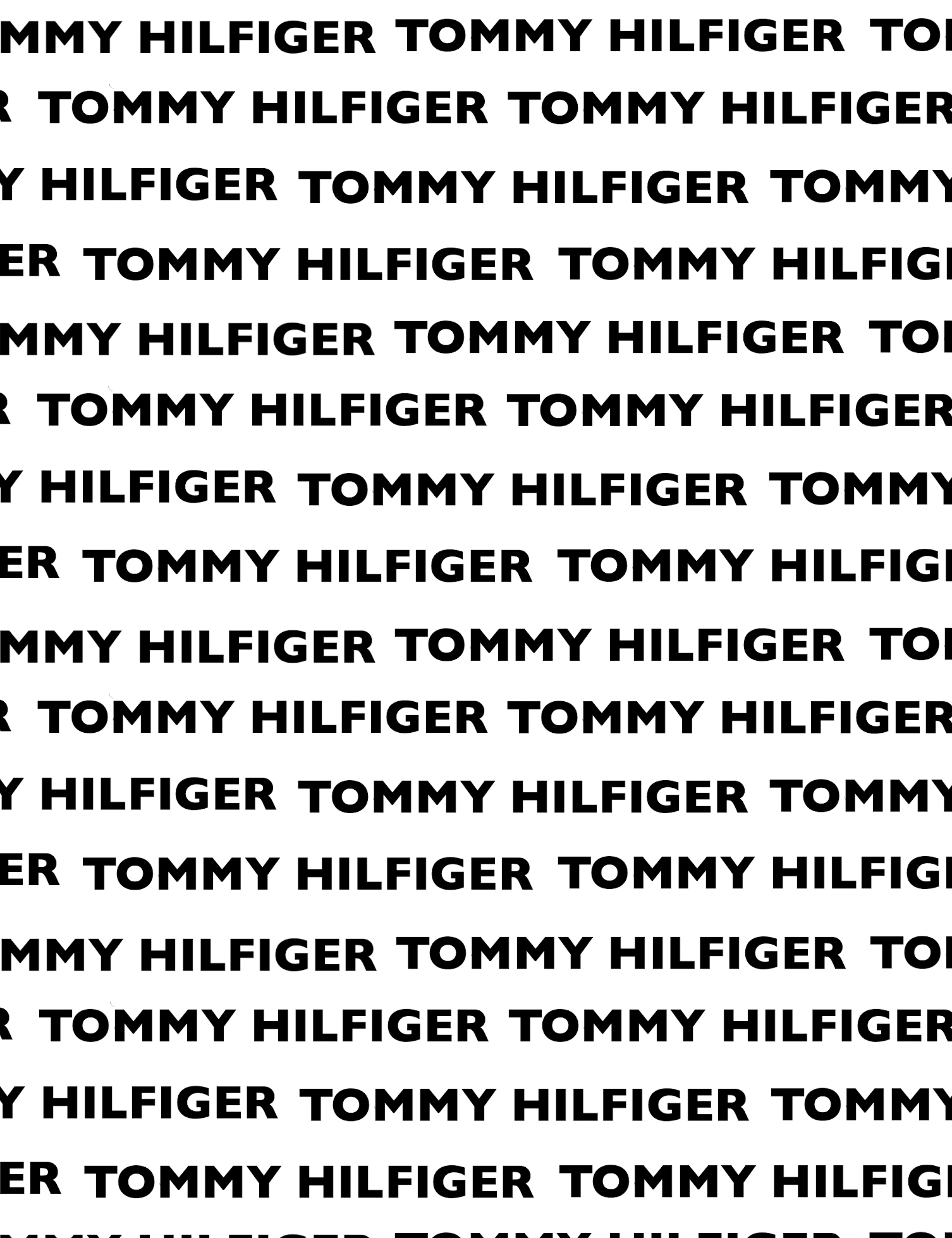
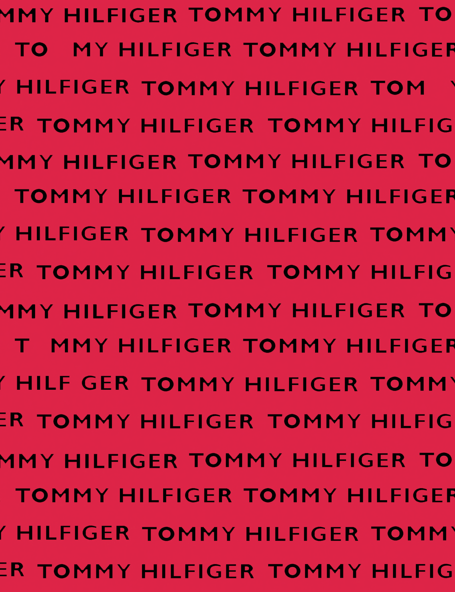
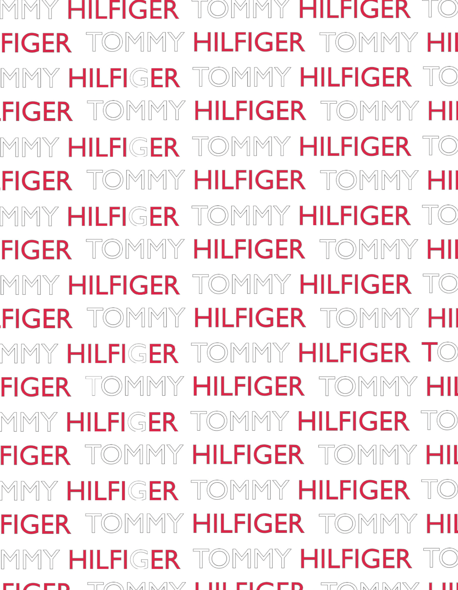
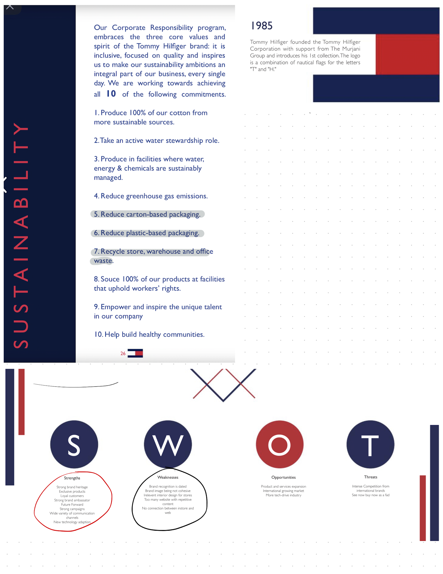
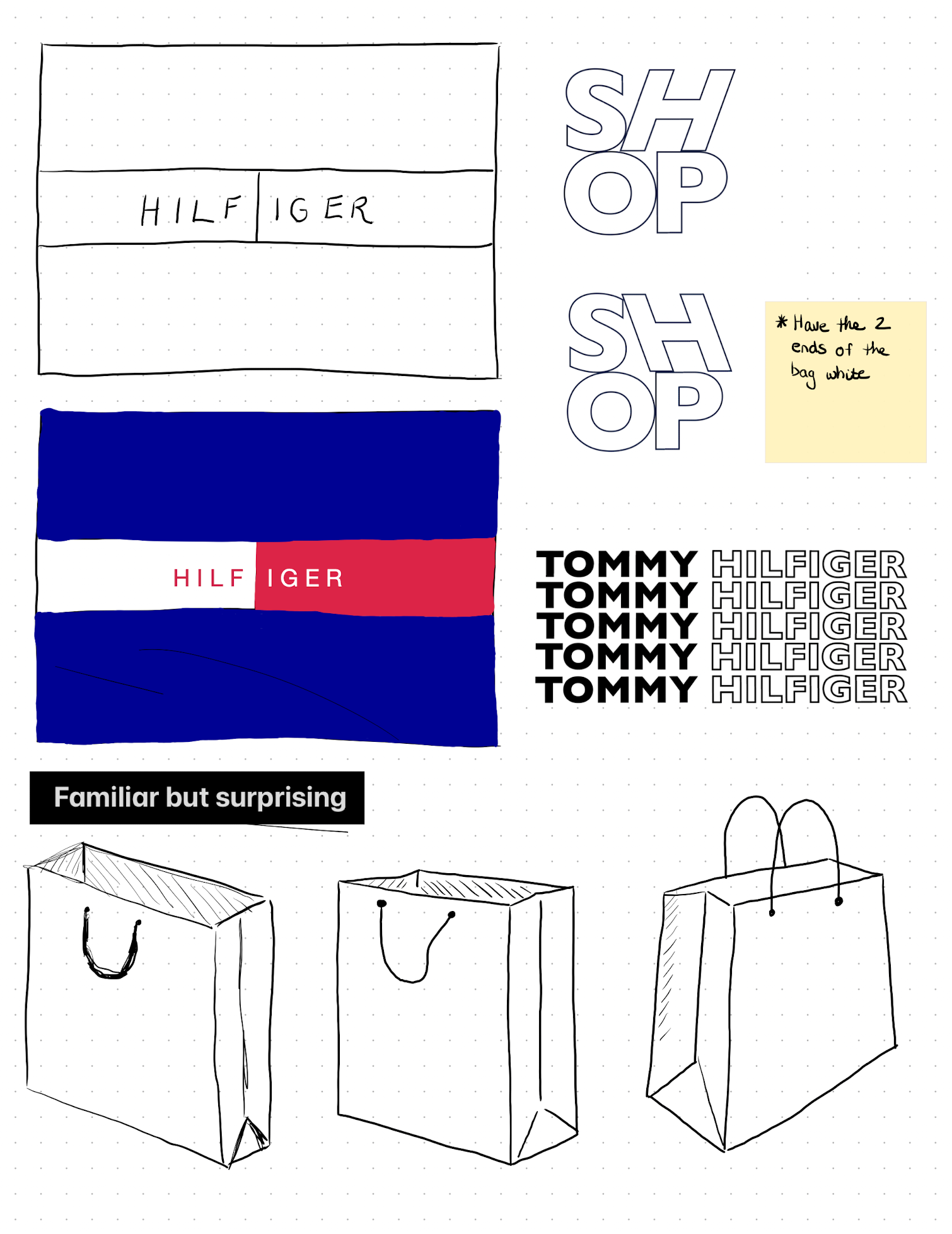
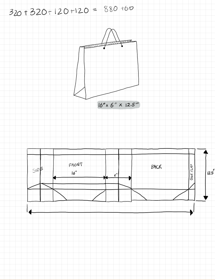
Bold. modern and typographic...just what the Tommy Hilfiger shopping bag needed desperately. The new redesign can easily be recognized while walking down the street in your city's shopping district.
Bold. modern and typographic...just what the Tommy Hilfiger shopping bag needed desperately. The new redesign can easily be recognized while walking down the street in your city's shopping district.
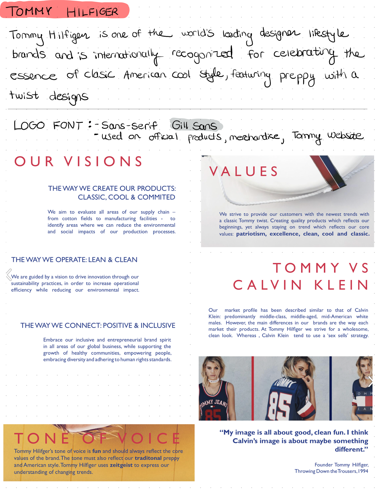
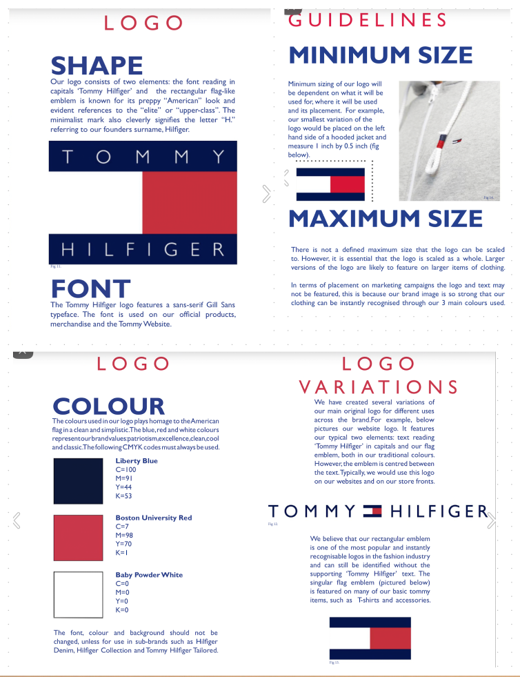
Process (Sketches & Concepts)
def